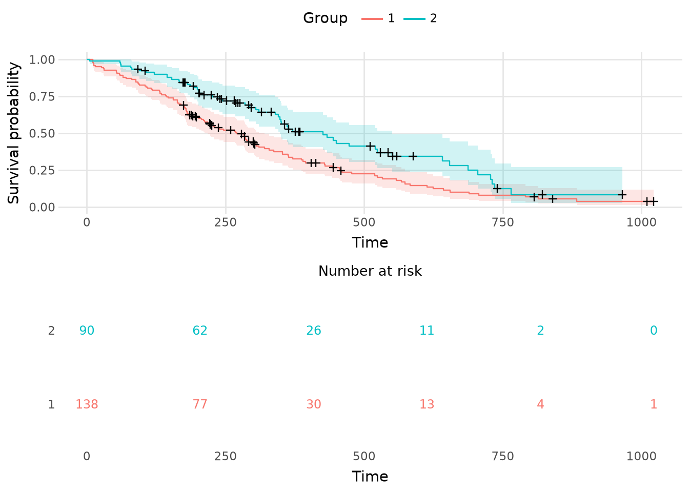
Plot Kaplan-Meier survival curve(s).
viz.plot_survival(
    km,
    *,
    conf_int=True,
    censor_marks=True,
    risk_table=False,
    times=None,
    xlab="Time",
    ylab="Survival probability",
    width=500,
    height=300,
    backend="altair"
)
Renders one or more Kaplan-Meier survival curves as a publication-ready visualization. By default uses interactive Altair (Vega-Lite) charts with optional plotnine (ggplot2) support. Each curve shows the proportion of subjects surviving (event-free) over time as a right-continuous step function, with an optional shaded confidence band and censoring marks. Stratified fits produce one colored curve per group with a legend.
Parameters
km: KaplanMeier-
A fitted KaplanMeier object, unstratified (single curve) or stratified.
conf_int: bool = True-
If True (default), draw the point-wise confidence band.
censor_marks: bool = True-
If True (default), mark censoring times with + symbols on the curve.
risk_table: bool = False-
If True, return a visualization stacking the curve over an aligned numbers-at-risk table. If False (default), return only the curve.
times: Any = None-
Query times for the numbers-at-risk table (used only if risk_table=True). Defaults to six evenly spaced, rounded times from 0 to the maximum observed follow-up time.
xlab: str = "Time"-
Axis labels (defaults "Time" and "Survival probability").
ylab: str = "Time"-
Axis labels (defaults "Time" and "Survival probability").
width: int = 500-
Plot dimensions (in pixels for Altair, inches for plotnine; defaults 500x300 pixels).
height: int = 500-
Plot dimensions (in pixels for Altair, inches for plotnine; defaults 500x300 pixels).
backend: str = "altair"-
Plotting backend:
"altair" (default, interactive Vega-Lite) or "plotnine" (ggplot2-style). Requires the corresponding extra: pip install greenwood[altair] or pip install greenwood[plotnine].
Returns
altair.LayerChart or altair.VConcatChart or plotnine.ggplot-
An Altair chart (if
backend="altair") or a plotnine ggplot object (if backend="plotnine"). With risk_table=True the Altair variant is a VConcatChart stacking the curve over an aligned numbers-at-risk table.
Examples
import greenwood as gw

lung = gw.load_dataset("lung", backend="polars")
y = gw.Surv.right(lung["time"], event=(lung["status"] == 2))
km = gw.KaplanMeier().fit(y, by=lung["sex"])

# Interactive Altair (default)
gw.plot_survival(km, risk_table=True)

# ggplot2-style (if plotnine is installed)
gw.plot_survival(km, backend="plotnine", risk_table=True)