import greenwood as gw
# Load data and fit a Cox model with three covariates
lung = gw.load_dataset("lung", backend="polars")
y = gw.Surv.right(lung["time"], event=(lung["status"] == 2))
cox = gw.CoxPH().fit(y, lung[["age", "sex", "ph.ecog"]])
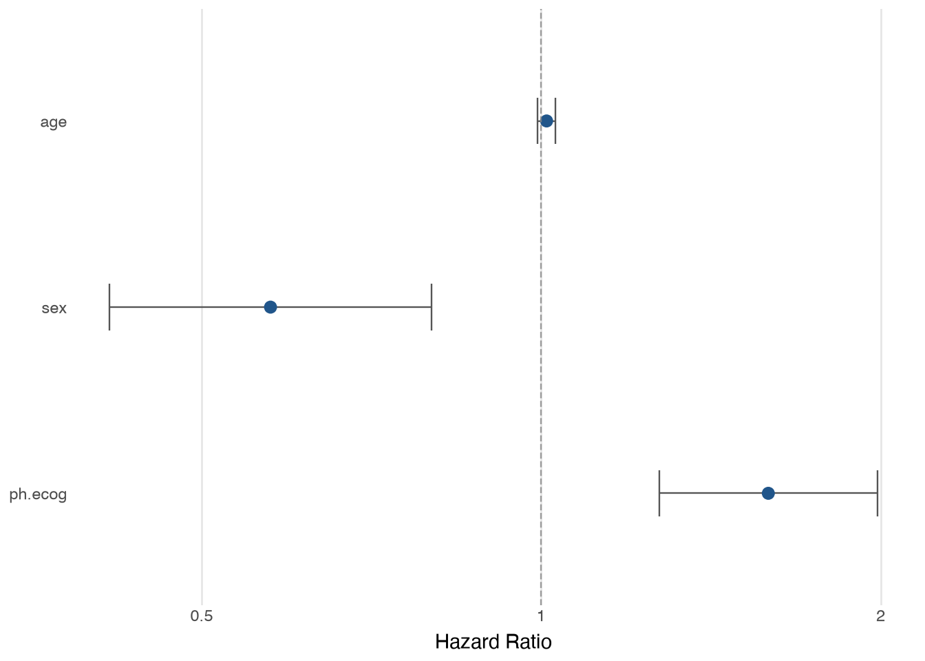
# Draw a forest plot of hazard ratios with confidence intervals
gw.plot_forest(cox)viz.plot_forest()
Forest plot of hazard ratios (or other contrasts) with confidence intervals.
Usage
viz.plot_forest(
    result,
    *,
    scale=None,
    exponentiate=True,
    title=None,
    term_labels=None,
    xlab=None,
    backend="altair",
    width=600,
    height=400
)
Accepts a fitted ~greenwood.CoxPH object or any tidy DataFrame that contains term, estimate, ci_lower (or conf_low), and ci_upper (or conf_high) columns. The latter supports subgroup forest plots where you already have the summary estimates (e.g., from running Cox per subgroup and calling ~greenwood.tidy on each).
Parameters
result: Any-
A fitted CoxPH result object, or a tidy DataFrame with one row per term.
scale: Literal["log", "linear"] | None = None-
X-axis scale:
"log"for hazard ratios (reference line at HR = 1) or"linear"for differences (reference line at 0). WhenNone(default), the scale is inferred:"log"for a CoxPH object withexponentiate=True,"linear"otherwise. Passscale="log"explicitly when supplying a DataFrame of hazard ratios. exponentiate: bool = True-
When result is a CoxPH object: if
True(default) extract hazard ratios; ifFalseextract log-hazard coefficients. Ignored when result is a DataFrame or when scale is set explicitly. title: str | None = None-
Plot title. Defaults to
None(no title). term_labels: dict[str, str] | None = None-
Optional mapping from internal term names to display labels, e.g.
{"age": "Age (years)", "sex": "Female vs. Male"}. Only the terms listed are renamed. Others keep their original names. xlab: str | None = None-
X-axis label. Defaults to
"Hazard Ratio"for log scale and"Estimate"for linear scale. backend: Literal["altair", "plotnine"] = "altair"-
Plotting backend:
"altair"(default, interactive) or"plotnine"(composable ggplot2-style object). width: int = 600-
Plot width in pixels (default 600). Altair only.
height: int = 400- Plot height in pixels (default 400). Altair only.
Returns
altair.Chart or plotnine.ggplot-
A composable chart object. Add layers, scales, or themes using the
+operator (plotnine) or.properties()/.interactive()(Altair).
Examples
Fit a Cox model and draw a forest plot of hazard ratios:
Rename terms for publication display:
# Relabel terms and add a title for publication display
gw.plot_forest(
    cox,
    term_labels={"age": "Age (years)", "sex": "Female vs. Male", "ph.ecog": "ECOG PS"},
    title="Cox Model: Lung Cancer",
)
Build a subgroup forest plot from a tidy DataFrame. Pass scale="log" when the estimates are hazard ratios:
import pandas as pd

# Define subgroup hazard ratios as a tidy DataFrame
subgroups = pd.DataFrame({
    "term": ["Age < 60", "Age \u2265 60", "Male", "Female"],
    "estimate": [0.72, 0.91, 0.85, 0.68],
    "ci_lower": [0.51, 0.74, 0.68, 0.50],
    "ci_upper": [1.01, 1.12, 1.06, 0.92],
})

# Plot on a log scale since the estimates are hazard ratios
gw.plot_forest(subgroups, scale="log")
For RMST differences or other linear-scale contrasts, omit scale (or pass scale="linear" explicitly):
# Define RMST differences for two treatment arms
rmst = pd.DataFrame({
    "term": ["Drug A vs Placebo", "Drug B vs Placebo"],
    "estimate": [45, 25],
    "ci_lower": [-10, -20],
    "ci_upper": [95, 70],
})

# Plot on the default linear scale (reference line at 0)
gw.plot_forest(rmst)
Use a plotnine backend for a static, composable ggplot object:
# Use the plotnine backend for a static, composable ggplot object
gw.plot_forest(cox, backend="plotnine")