| Population of Selected European Countries (2020) | |
| Country | Population |
|---|---|
| Germany | 83,160,871 |
| France | 67,601,110 |
| Italy | 59,438,851 |
| Spain | 47,359,424 |
1 Introduction
Tables are everywhere. They appear in financial reports, scientific papers, train schedules, and restaurant menus. We encounter them so frequently that we rarely pause to consider what makes them work. Or, why humanity has relied on this particular arrangement of rows and columns for thousands of years. Yet this ubiquity belies a remarkable sophistication. The table is not merely a grid of values but a carefully evolved technology for organizing information, one that predates written language itself and continues to shape how we understand the world.
Consider for a moment the sheer variety of tables you might encounter in a single day. The nutrition label on your breakfast cereal is a table. The weather forecast in your news app presents temperatures and conditions in tabular form. Your bank statement arranges transactions in rows, with columns for date, description, and amount. The departure board at the train station, the periodic table on a classroom wall, the league standings in the sports section: all tables, each serving a distinct purpose but sharing the same fundamental structure.
This chapter traces the table’s journey from ancient clay tablets to modern software, exploring why this seemingly simple format has proven so enduring and adaptable. Along the way, we’ll examine what distinguishes tables from other forms of information display, how printing technology transformed tabular presentation, and how computational tools have both expanded and complicated what tables can do. We’ll conclude by considering how gt, the R package that is the subject of this book, fits into this long history and what principles guide its approach to table creation.
1.1 The origins of tabular thinking
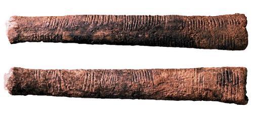
The impulse to arrange information in rows and columns appears to be deeply human. Long before the first writing systems emerged, humans were scratching tally marks into bones and cave walls. This is an early form of record-keeping that, while not quite a table, reflects the same desire to organize discrete pieces of information in a structured, retrievable way. The Ishango bone, discovered in what is now the Democratic Republic of Congo and dated to approximately 20,000 years ago, bears notched marks that some scholars interpret as an early tally system (de Heinzelin, 1962; Huylebrouck, 2019). Whether or not these marks constitute a proto-table, they reveal an ancient impulse toward systematic record-keeping.
The earliest recognizable tables date to ancient Mesopotamia, around 2000 BCE (Neugebauer, 1957; Robson, 2008). Babylonian scribes pressed cuneiform characters into clay tablets to create multiplication tables, tables of reciprocals, and astronomical tables tracking lunar and planetary movements. These weren’t mere lists. Rather, they were organized with clear row and column structure, allowing readers to look up values by cross-referencing categories. A Babylonian merchant could consult a table to calculate interest on a loan. An astronomer could predict when Venus would next appear in the evening sky.
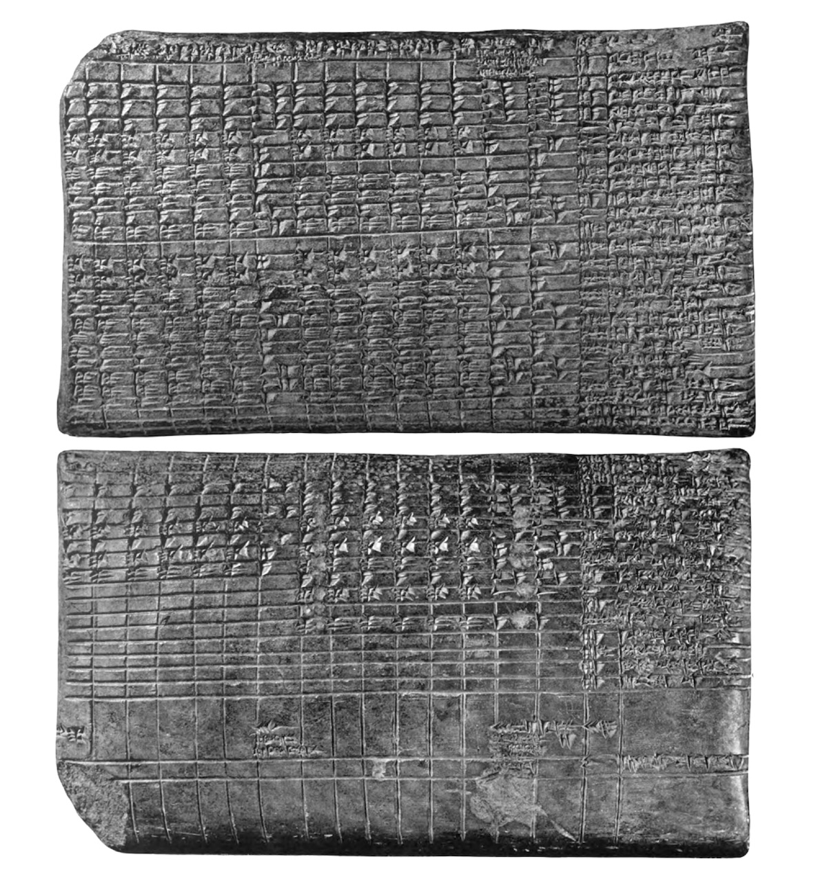
The sophistication of these early tables is striking. Some Babylonian astronomical tablets contained dozens of columns, each representing a different mathematical series used to predict celestial phenomena. The tablet known as Mul-Apin, dating to around 1000 BCE, compiled star catalogs, planetary periods, and seasonal information in tabular formats that remained authoritative for centuries (Hunger & Pingree, 1999). The scribes who created them understood something fundamental: when information has multiple dimensions (when you need to find a value based on two or more criteria) a tabular format dramatically reduces the cognitive burden on the reader. Instead of searching through prose descriptions or performing calculations from first principles, one simply locates the appropriate row and column and reads the answer directly.

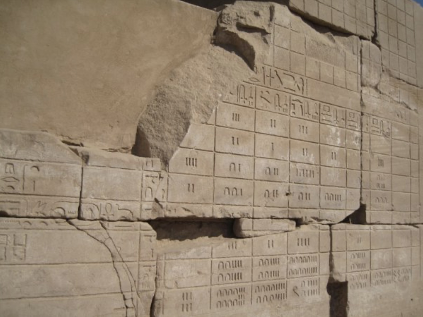
This efficiency principle drove the adoption of tables across ancient cultures. Egyptian surveyors used tables to calculate land areas for taxation, essential work in a civilization whose agricultural prosperity depended on the annual flooding of the Nile. The Rhind Mathematical Papyrus, dating to around 1550 BCE, contains tables for converting fractions: a practical tool for scribes who needed to divide rations among workers or calculate shares of harvested grain (Imhausen, 2016).

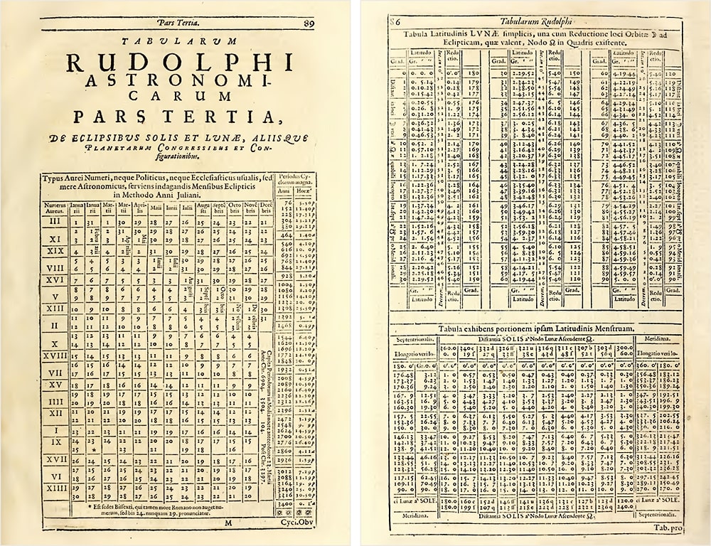
Greek astronomers, building on Babylonian work, created sophisticated trigonometric tables (Jones, 1991). Hipparchus, working in the second century BCE, compiled a table of chords that served essentially as a trigonometric reference, enabling calculations in astronomy and geography. Ptolemy’s Almagest, written in the second century CE, contained extensive astronomical tables that would remain the standard reference for over a millennium (Toomer, 1984).
Roman tax collectors and administrators maintained census records that tracked populations, property, and obligations across the vast empire. While many ancient administrative records were organized as prose or lists rather than true tables, the underlying challenge was the same: how to structure multi-dimensional information so it could be reliably retrieved. In each case where tables were used, they served the same essential function: transforming complex information into a format that could be quickly consulted and reliably interpreted.
1.2 Tables in the medieval and early modern world
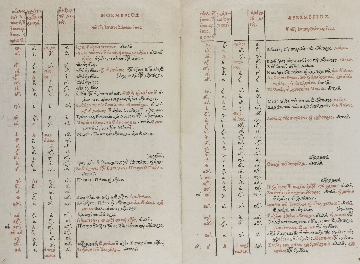
The fall of Rome and the fragmentation of Europe might have disrupted the tradition of table-making, but the format persisted. It was preserved in monasteries, transmitted through Islamic scholarship, and eventually rekindled during the Renaissance. Medieval monks, laboriously copying manuscripts, maintained astronomical tables, calendrical computations, and reference works that kept the tabular tradition alive through centuries of political upheaval.
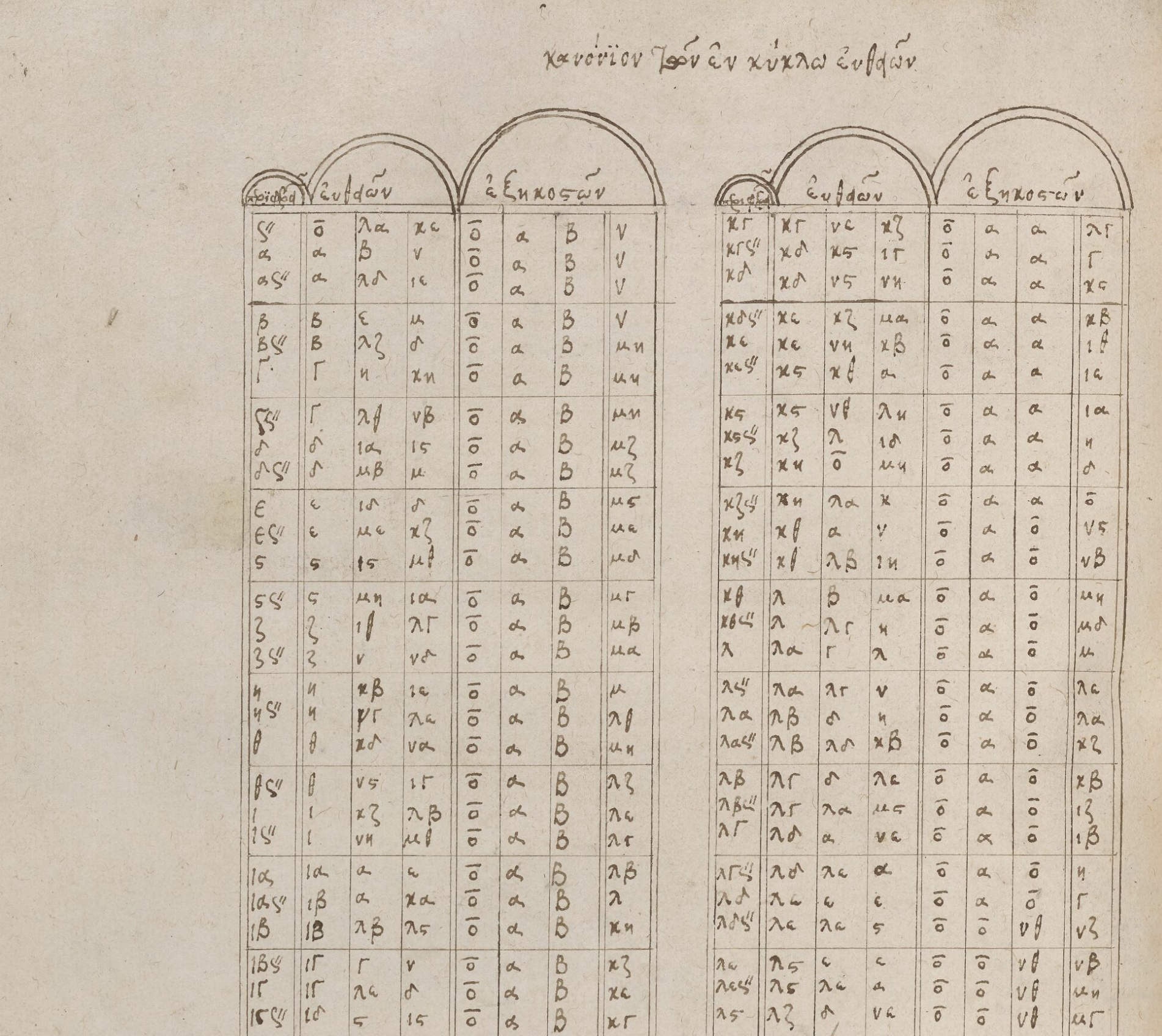
Islamic scholars made particularly important contributions to the development of tables during the medieval period. Building on Greek and Indian mathematical traditions, astronomers in the Islamic world created elaborate astronomical tables called Zij (Kennedy, 1956). These comprehensive works contained tables for calculating the positions of the sun, moon, and planets, along with tables for trigonometric functions, geographical coordinates, and calendrical conversions. The Zij of al-Khwarizmi, compiled in the ninth century, and the later Zij of Ulugh Beg, produced in fifteenth-century Samarkand, represented the pinnacle of pre-telescopic astronomical tabulation (Saliba, 2007). Their precision and comprehensiveness would not be surpassed until the scientific revolution.
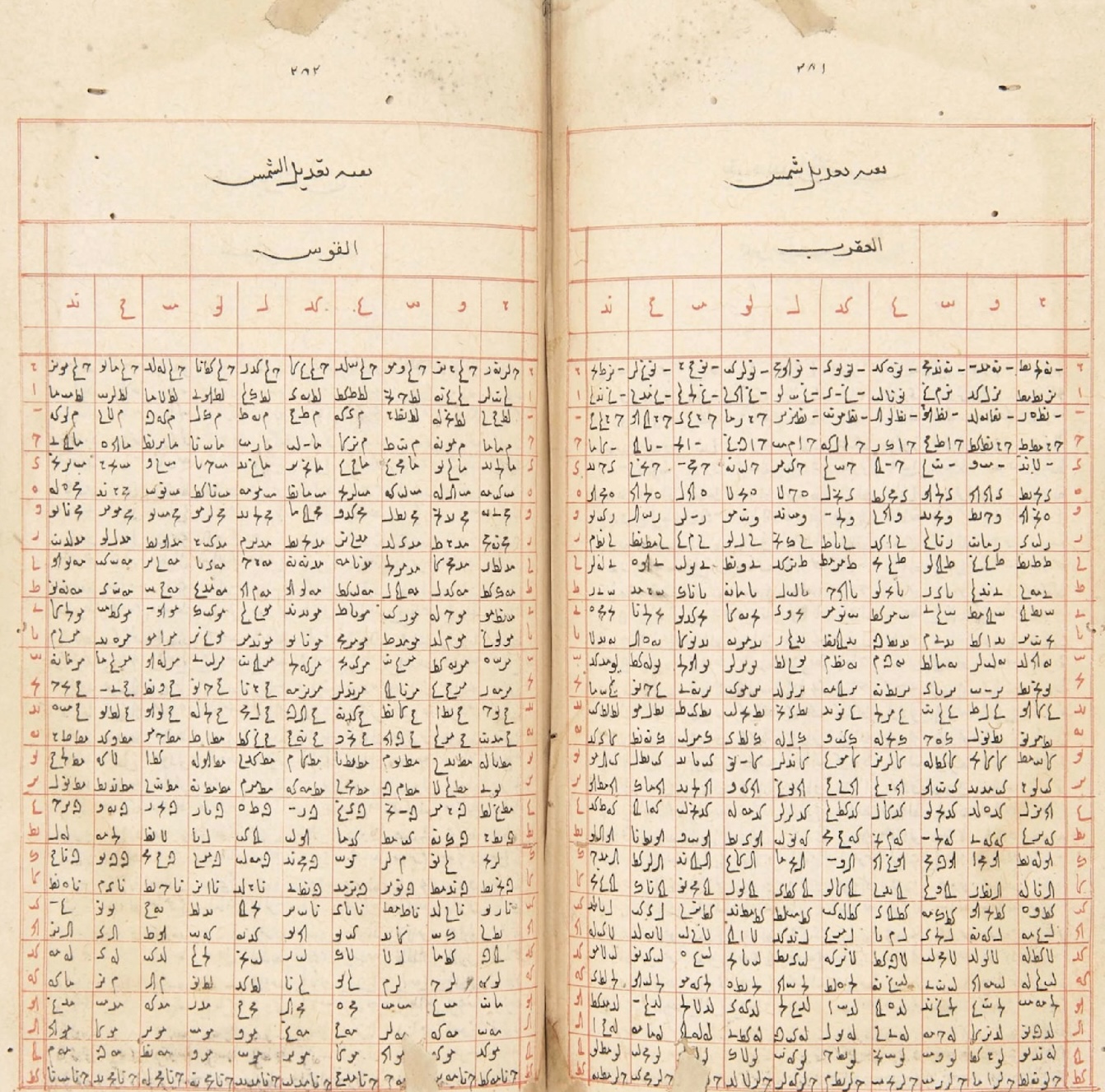
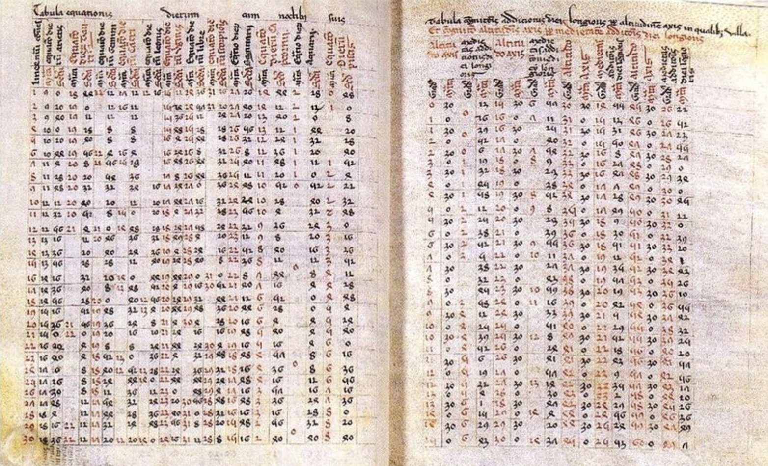
In medieval Europe, astronomers relied heavily on the Alfonsine Tables, compiled in Toledo in the thirteenth century under the patronage of King Alfonso X of Castile. These tables, which incorporated both Islamic astronomical knowledge and new observations, became the standard reference for planetary calculations throughout Europe for over three centuries. Their wide circulation in manuscript form testifies to the essential role that tabular formats played in transmitting astronomical knowledge across cultures and centuries.
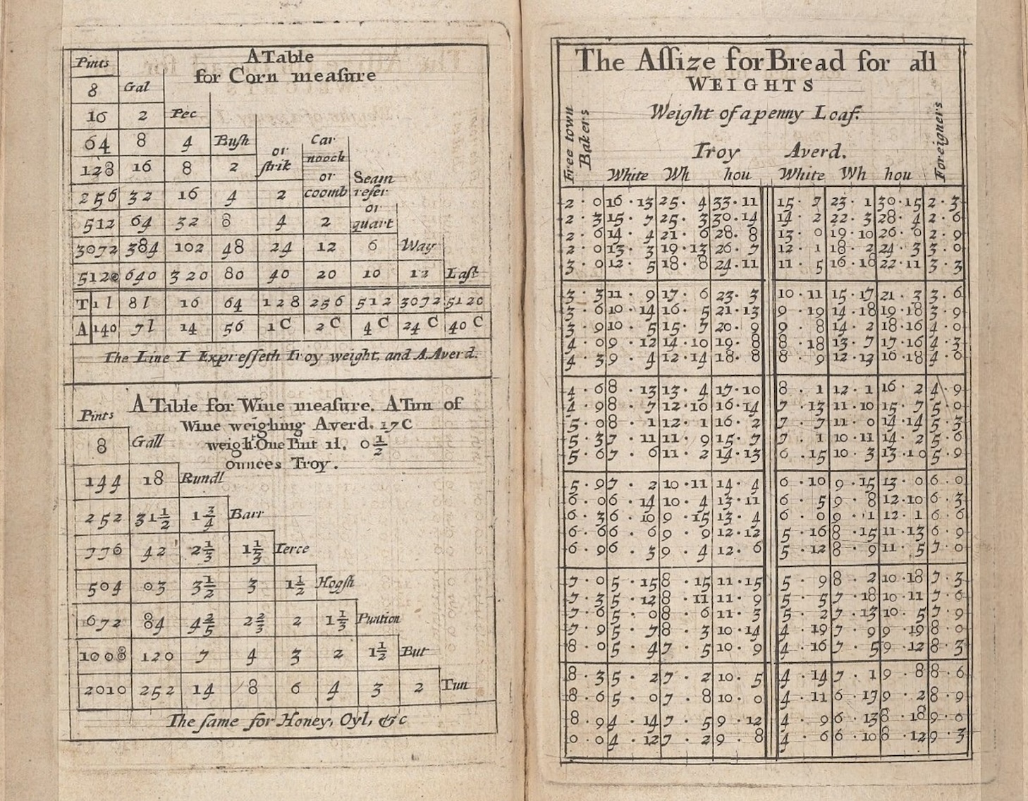
The Renaissance brought renewed interest in classical learning and, with it, renewed appreciation for the utility of tables. Merchants in the growing commercial centers of Italy and the Low Countries developed sophisticated accounting practices that relied heavily on tabular formats. Double-entry bookkeeping, systematized by Luca Pacioli in 1494, organized financial information into tables of debits and credits that remain fundamental to accounting today (Sangster, Stoner, & McCarthy, 2008). The spread of commercial arithmetic (practical mathematics for merchants, bankers, and traders) depended on printed tables of interest rates, currency conversions, and commercial weights and measures.
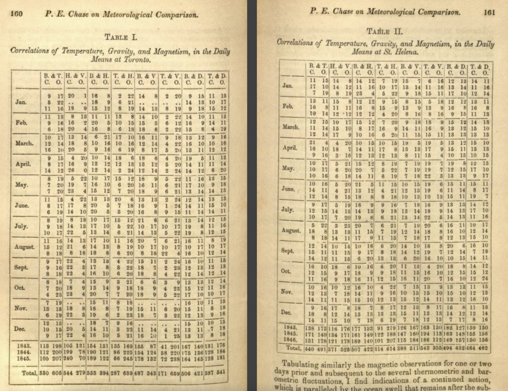
The scientific revolution of the sixteenth and seventeenth centuries generated an explosion of tabular data. Tycho Brahe’s meticulous astronomical observations, compiled into tables, provided the foundation for Johannes Kepler’s laws of planetary motion.
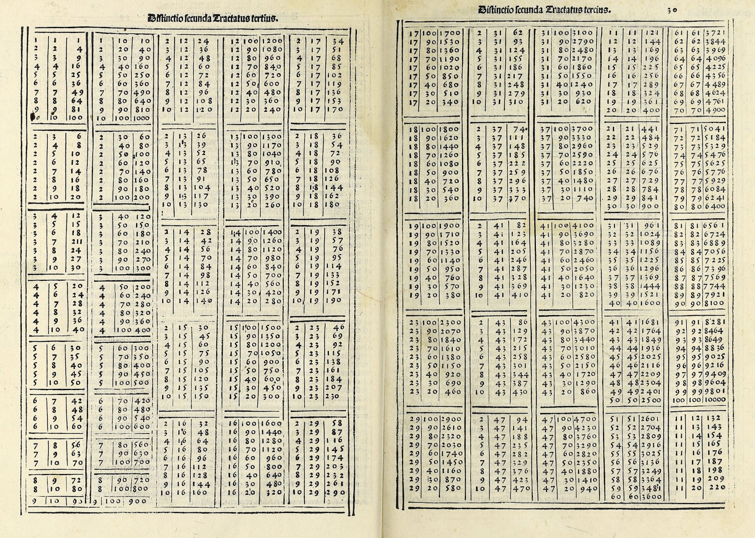
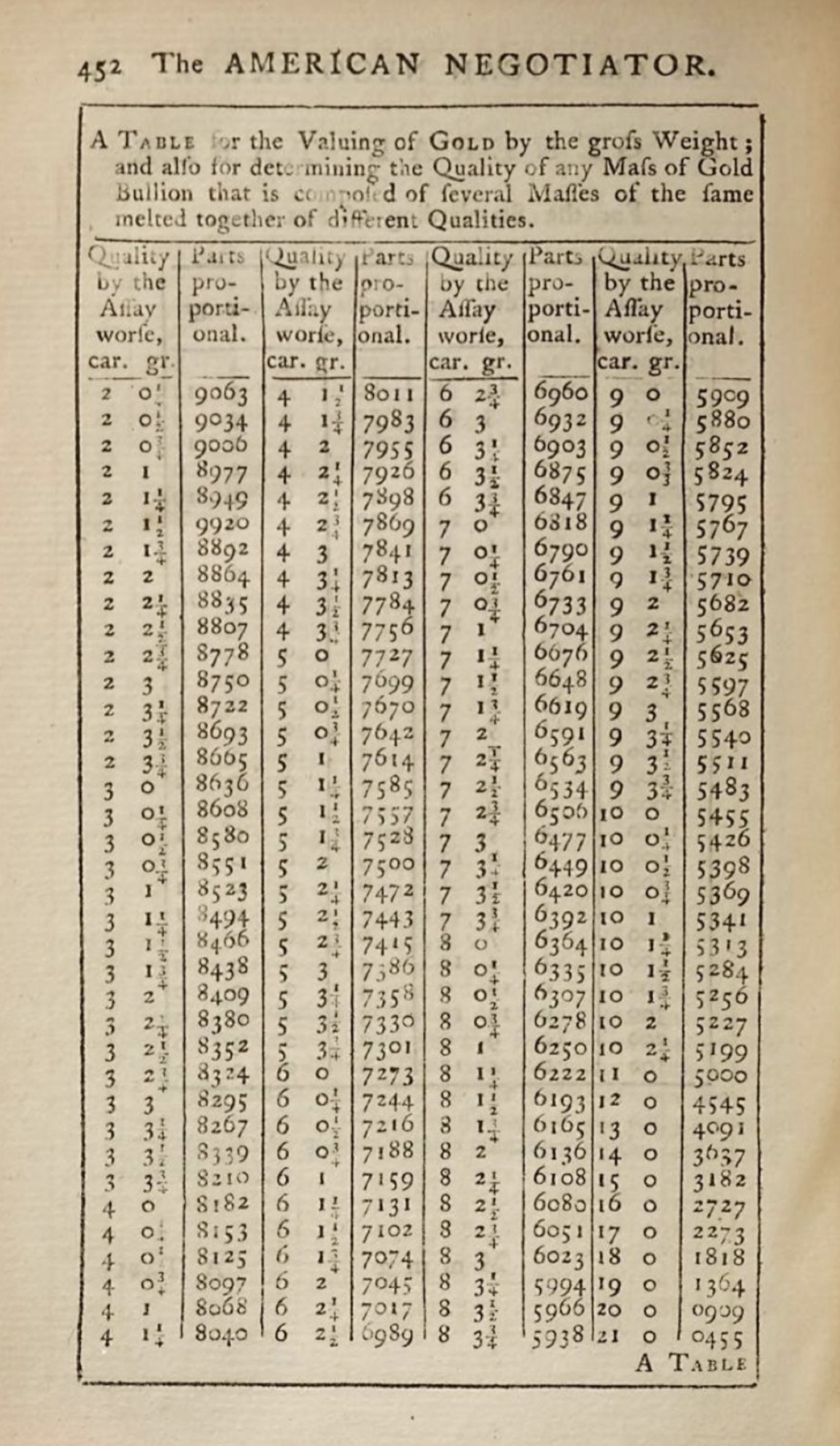
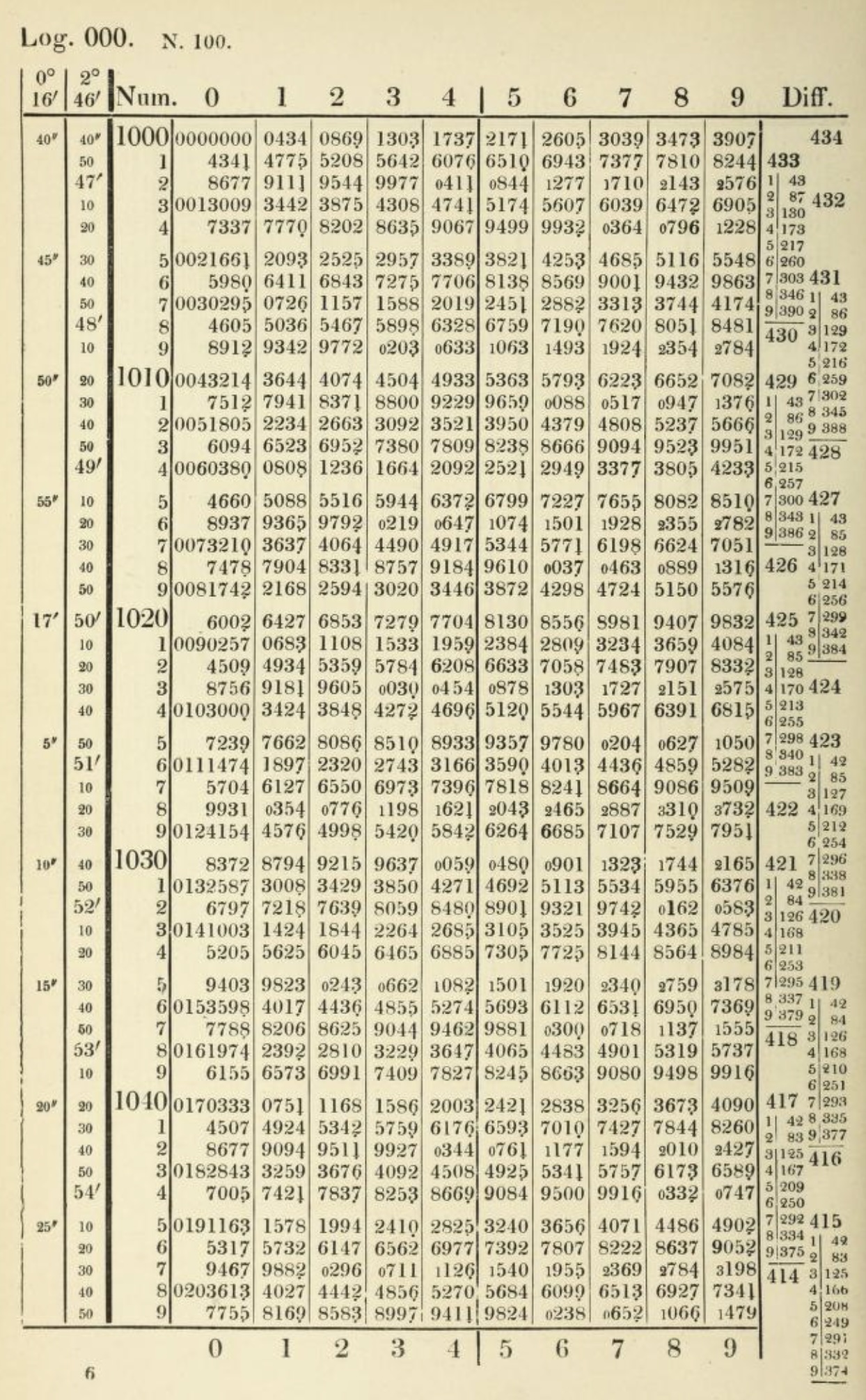
John Napier’s invention of logarithms in 1614 was accompanied by the publication of logarithmic tables that transformed calculation by converting multiplication into addition (Campbell-Kelly et al., 2003). These tables became essential tools for astronomers, navigators, surveyors, and engineers (anyone whose work required complex arithmetic). For nearly four centuries, until electronic calculators became widely available, logarithmic tables remained indispensable equipment for technical work.
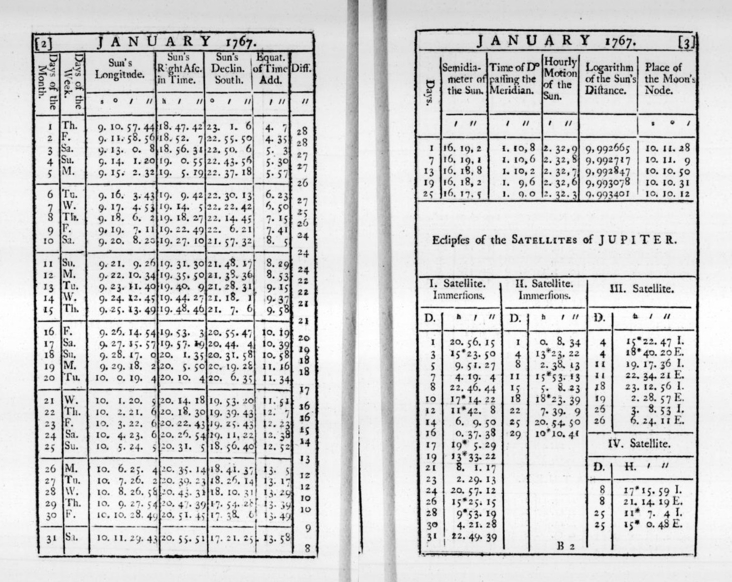
Navigation tables deserve particular mention. The age of exploration created urgent demand for tables that could help sailors determine their position at sea. Tables of solar declination, lunar distances, and stellar positions allowed navigators to calculate latitude and (eventually) longitude from celestial observations. The British Nautical Almanac, first published in 1767 and still in print today, provided the tabular data that made reliable ocean navigation possible (Maskelyne, 1766). Errors in these tables could mean shipwreck and death so their accuracy was a matter of national importance. The calculation and verification of navigation tables employed generations of human “computers”, who were skilled mathematicians that spent their careers performing the arithmetic necessary to produce reliable tabular values (Grier, 2005).
1.3 Tables versus text: the cognitive advantage
Why do tables work so well? The answer lies partly in how human visual perception operates. When information is arranged in a grid, our eyes can rapidly scan along rows and columns to locate relevant data. We don’t need to read every cell. The spatial structure itself conveys meaning. A value’s position tells us what category it belongs to before we even read the value itself.
Cognitive scientists have studied this phenomenon extensively. Research on visual search demonstrates that humans are remarkably efficient at locating targets in organized spatial arrays. When items are arranged in regular rows and columns, we can use the grid structure to guide our attention, eliminating large portions of the display from consideration without conscious effort. This is fundamentally different from how we process prose, which must be read sequentially and parsed grammatically before its meaning can be extracted.
Consider the alternative: presenting the same information as prose. A sentence like “The population of France in 2020 was 67 million, while Germany had 83 million, Italy had 60 million, and Spain had 47 million” requires the reader to parse the grammatical structure, extract the country names and values, and mentally construct the relationships between them. The same information in a simple two-column table can be grasped almost instantaneously:
The table format offers several distinct advantages. First, it separates the data from the syntax that would otherwise be needed to express it. In prose, we need words like “while”, “had”, and “was” to connect the values. In a table, the structure itself provides the connections. Second, tables support comparison. Aligning values vertically makes it trivially easy to see that Germany is the most populous country in the list. Third, tables are scannable. A reader looking specifically for Spain’s population can locate it without reading about France, Germany, or Italy.
These advantages become even more pronounced as the amount of data increases. A table with fifty rows and five columns remains relatively easy to navigate. The equivalent prose (dozens of sentences, each stuffed with multiple values) would be nearly impossible to use effectively. Edward Tufte, the influential information designer, captured this distinction by noting that tables are “clearly the best way to show exact numerical values” (Tufte, 2001). Graphs may reveal patterns and trends more vividly, but when precision matters, tables are unmatched.
The psychologist George Miller famously identified “seven plus or minus two” as the typical capacity of human working memory: the number of distinct items we can hold in mind simultaneously (Miller, 1956). Tables help us work around this limitation. Instead of trying to remember multiple values and their relationships, we can offload that burden onto the table’s structure. The information remains available for consultation and we need only remember where to look.
This cognitive offloading extends to more complex operations. When comparing values across multiple dimensions (say, sales figures across different products, regions, and time periods) a well-designed table allows us to perform comparisons that would otherwise exceed our mental capacity. We can scan down a column to compare products, across a row to compare regions, or diagonally to trace trends over time. The table serves as an external memory and calculation aid, extending our cognitive capabilities beyond their natural limits.
This doesn’t mean tables are always superior. Prose is good at conveying narrative, context, and nuance (the kinds of qualitative information that resist easy categorization). A story about economic hardship cannot be reduced to a row of numbers. The human experience it describes requires language that tables cannot provide. And visual displays like charts and maps can reveal relationships that tables obscure. A scatterplot showing the correlation between two variables makes patterns visible at a glance; the same data in tabular form would require careful study to discern. The point is not that tables should replace other forms of communication but that they occupy a distinctive niche: they are the optimal format for presenting structured, precise, multi-dimensional information to readers who need to look up, compare, or verify specific values.
1.4 From manuscript to print: the typographic revolution
For most of history, tables were created by hand. Scribes copied them laboriously, introducing errors with each transcription. A misplaced digit in an astronomical table could lead to incorrect predictions. An error in a financial table could affect fortunes. The profession of table-making was consequently a skilled one, requiring not only arithmetic competence but also meticulous attention to layout and proofreading.
The invention of printing with movable type in the fifteenth century began to change this, but tables posed particular challenges for early printers. Text could be set from pre-cast letter blocks, but tables required careful alignment across multiple columns. This resulted in a fussier process that demanded specialized techniques. The type cases designed for ordinary text printing didn’t include the thin metal strips needed for ruled lines. Printers had to improvise or commission special materials.
The early printed tables were often crude by modern standards. Columns might be separated by vertical lines drawn by hand after printing, or, by simple spacing (that might shift if the paper expanded or contracted). The horizontal rules that we now take for granted (the lines separating header rows from data, one section from another, etc.) were difficult to produce consistently. Many printers avoided tables altogether, preferring to present numerical information as prose or lists.
Gradually, however, typographic conventions emerged. Printers developed techniques for casting thin metal rules that could be assembled into table frameworks. They experimented with different approaches to column separation: ruled lines, generous white space, alternating shading. They learned that aligning numbers by their decimal points made tables more readable. They discovered that headers could be distinguished through boldface, italics, or capital letters, and that horizontal rules helped readers track across long rows.
The sixteenth and seventeenth centuries saw the emergence of specialized table printers who developed proprietary techniques and competed for lucrative contracts. Mathematical tables, almanacs, and commercial reference works represented significant markets. The accuracy of these publications was a selling point. Printers advertised the care taken in their verification. Some publishers hired professional calculators to check every entry, while others offered rewards for errors discovered by readers.
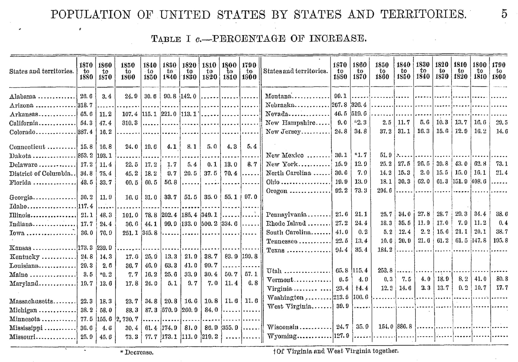
By the nineteenth century, the typography of tables had become a sophisticated craft. Scientific publishers developed elaborate conventions for statistical tables, with clear hierarchies of headers, stub columns for row labels, and footnotes for qualifications and sources. The stub, which is the leftmost column containing row labels, became recognized as a distinct structural element requiring its own typographic treatment. Nested headers, spanning multiple columns, conveyed hierarchical relationships among variables. Footnotes, marked with symbols or superscript numbers, allowed qualifications and explanations without cluttering the main body of the table.
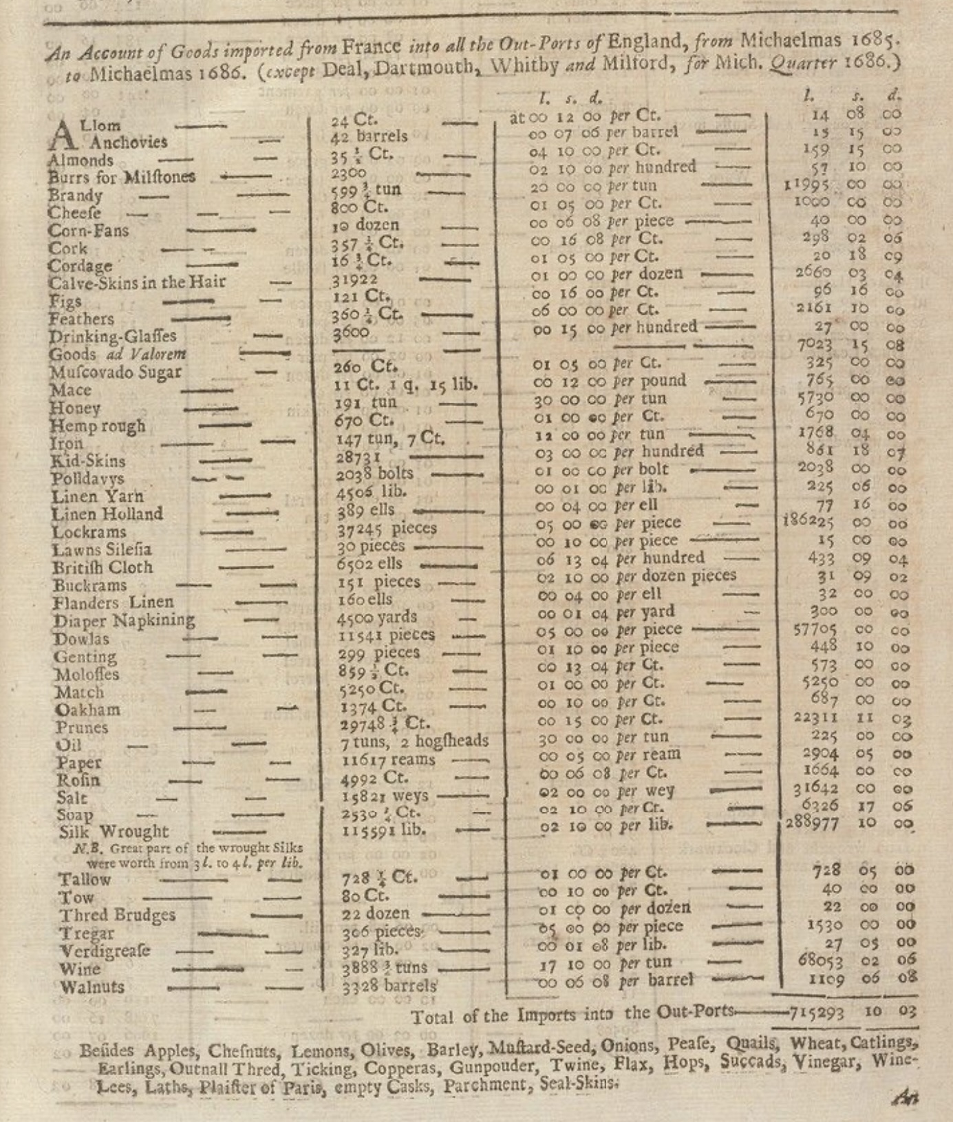
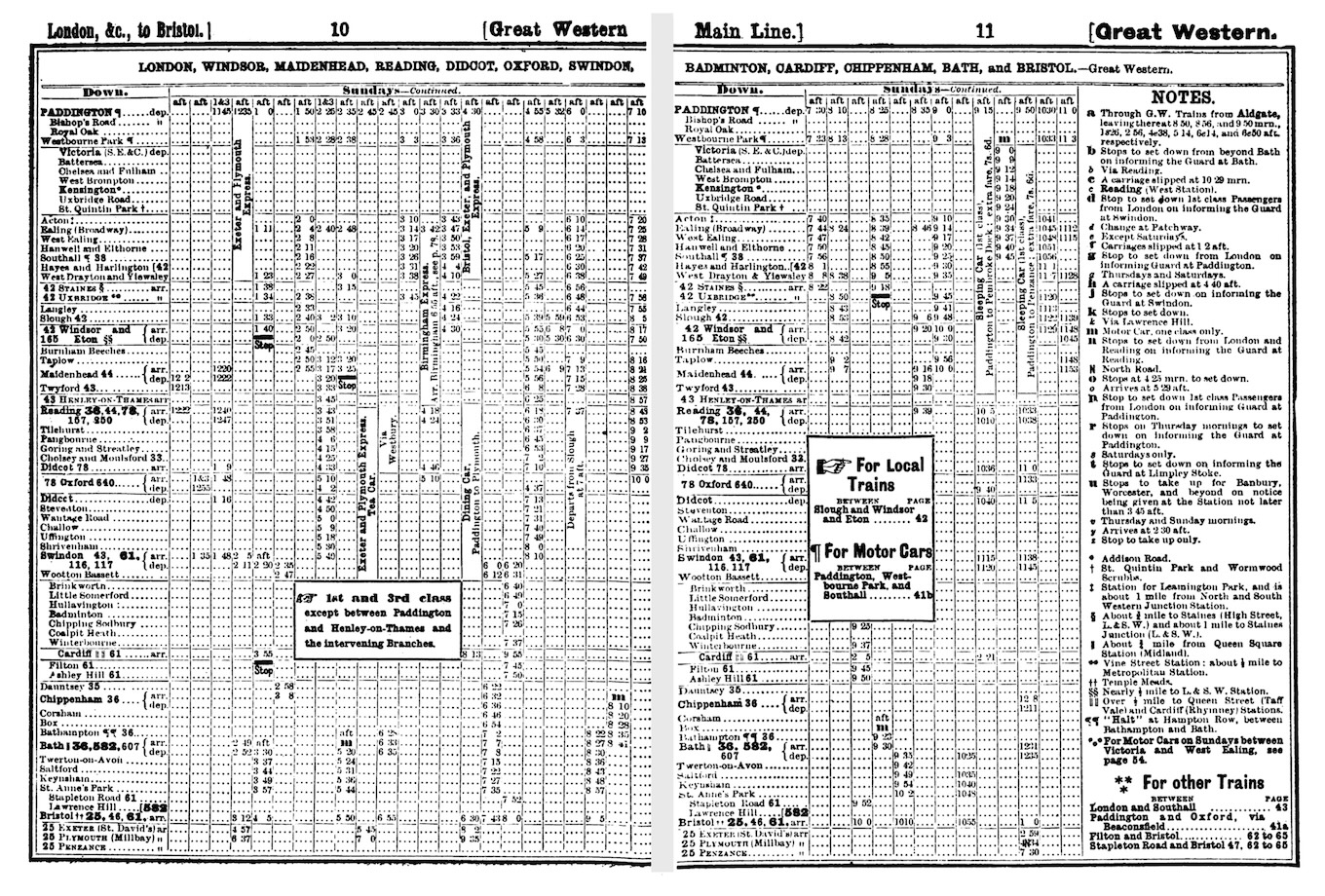
Financial tables grew increasingly complex, with nested column headers and multi-level row groupings. The annual reports of major corporations, the prospectuses of stock offerings, and the statistical publications of governments all demanded sophisticated tabular presentation. Railway timetables, a distinctly modern invention, demonstrated that tables could convey temporal as well as categorical structure. The Bradshaw’s railway guide, first published in 1839, became legendary for its dense, intricate tables that allowed travelers to plan journeys across Britain’s growing rail network (Simmons, 1991). Its complexity was both mocked and admired. Sherlock Holmes consulted it repeatedly in Arthur Conan Doyle’s stories.
The aesthetic standards for printed tables also evolved. Victorian-era tables often featured elaborate decorative rules and ornate headers that seem excessive to modern eyes (e.g., heavy borders, ornamental corner pieces, and intricate typographic flourishes). This reflected broader Victorian tastes for elaborate decoration, but it also served a practical purpose: in an era before photocopying and electronic transmission, distinctive styling helped identify the source and authenticity of printed tables.
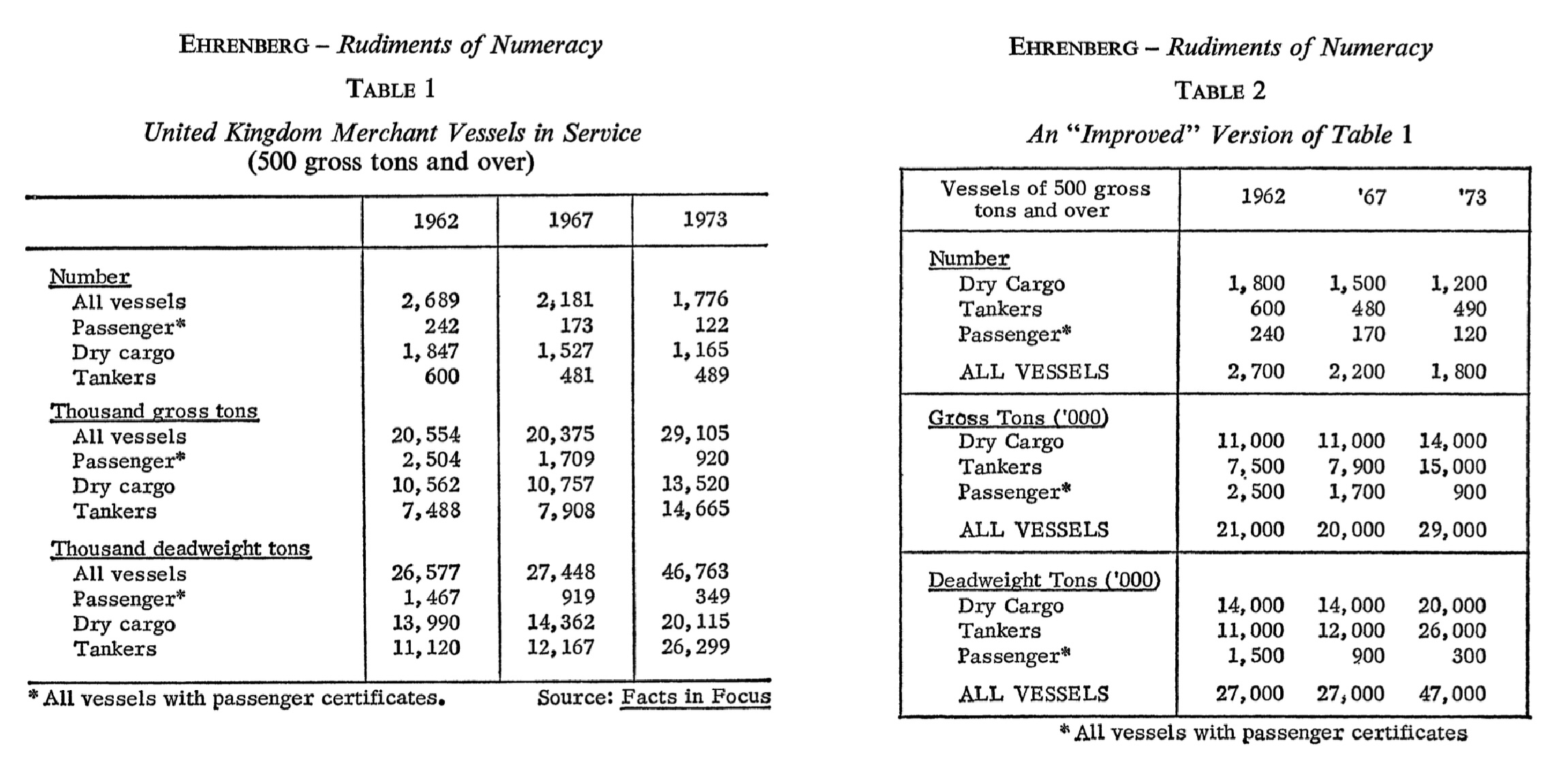
The twentieth century brought a movement toward simplification. Statisticians like Andrew Ehrenberg argued that heavy rules and excessive ornamentation actually impeded understanding (Ehrenberg, 1977). In his influential guidelines for table design, Ehrenberg demonstrated that many conventional table elements (vertical rules, cell borders, unnecessary shading, etc.) added visual noise without improving comprehension (Wainer, 1984). The “less is more” philosophy gradually prevailed, leading to the clean, minimalist table designs that predominate today: horizontal rules used sparingly to separate logical sections, ample white space, and careful attention to typography.
1.5 Tables and the authority of numbers
Tables do more than present information efficiently, they also convey authority. A claim supported by a table of data carries more weight than the same claim made in prose. This association between tables and credibility has deep historical roots and continues to shape how we communicate quantitative information.
The authority of tables derives partly from their association with precision and objectivity (Porter, 1995). When information is presented in tabular form, it appears to have been measured, counted, or calculated (not merely asserted). The rigid structure of rows and columns suggests systematic organization and careful verification. The numbers themselves carry connotations of scientific rigor, even when the underlying data is uncertain or contested.
This authority can be deserved or manufactured (Best, 2001). A table of experimental results, carefully collected and analyzed, genuinely supports the conclusions drawn from it. But tables can also create an illusion of precision that masks underlying uncertainty or bias. Publishing polling data in tabular form suggests definiteness that the margins of error rarely convey. Financial projections presented as tables imply a predictability that markets rarely exhibit. The very format that makes tables useful for legitimate communication also makes them effective tools for persuasion and manipulation.
Historians of statistics have documented how the rise of quantification in the nineteenth century was accompanied by proliferating tables in government reports, scientific publications, and commercial documents (Porter, 1995; Desrosières, 1998). “Statistics” originally meant the science of state, the collection and tabulation of information useful for governance. Census tables counted populations, vital statistics tables tracked births and deaths, trade tables documented imports and exports. These tabulations served administrative purposes, but they also shaped public discourse by making certain kinds of claims possible. Once a phenomenon was tabulated, it became available for comparison, trending, and policy intervention in ways that qualitative descriptions did not permit.
The sciences adopted tables as standard equipment for reporting empirical results. The format of scientific papers crystallized around figures and tables presenting data, with prose relegated to interpretation and contextualization. To this day, the “results” section of a scientific paper typically centers on tables and figures. The authority of the findings depends significantly on how convincingly the data is tabulated.
Understanding this relationship between tables and authority is important for anyone who creates tables professionally. With the power to make claims appear credible comes the responsibility to ensure that the claims are actually supported by the data. A well-designed table doesn’t just present information clearly, it also represents that information honestly, acknowledging uncertainty where it exists and avoiding presentations that would mislead readers. The visual conventions of tables (alignment, precision, formatting) should serve clarity rather than creating false impressions.
1.6 The computational transformation
The advent of electronic computing in the mid-twentieth century transformed every aspect of data work, and tables were no exception (Ceruzzi, 2003). Early computers could generate tables of astonishing size and precision. Actuarial tables, mathematical tables, census tabulations are some examples. These would have taken human calculators years to produce by hand. The ENIAC (one of the first general-purpose electronic computers) was initially used to calculate artillery firing tables, a task that had previously occupied teams of human computers for months (Goldstine, 1972). What once required armies of mathematicians could now be accomplished in hours.
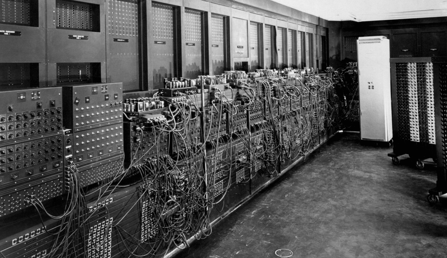
But these early computer-generated tables were constrained by the output technology of the time: line printers that could produce only fixed-width characters, with no variation in font, weight, or size. These printers worked by striking an inked ribbon against paper through a rotating drum or chain of characters, much like a very fast typewriter. They were optimized for speed and reliability, not typographic sophistication.
The tables that emerged from line printers had a distinctive aesthetic: monospaced characters arranged in rigid columns, often with ASCII characters like dashes, pipes, and plus signs used to simulate rules and borders. This style persists in some contexts today (command-line interfaces and plain-text data files still use it) but it was a significant step backward from the typographic sophistication that printed tables had achieved. A line-printer table could not use bold or italic type to distinguish headers, it could not align numbers by decimal points (since all characters were the same width), and it could not adjust column widths to fit content elegantly.
The limitations of line-printer output created a cultural divide between “computer tables” and “publication tables”. For serious publication, computer output had to be manually retyped by skilled typists or sent to professional typesetters. This reintroduced the errors and delays that computing was supposed to eliminate. An analyst might have data processed in minutes but wait weeks for properly formatted tables.
The development of word processors and desktop publishing software in the 1980s began to restore table-making capabilities. Users could once again create tables with proper typography: proportional fonts, bold headers, visible rules. Software like WordPerfect, Microsoft Word, and later desktop publishing applications like PageMaker and QuarkXPress included table features that allowed precise control over cell formatting, borders, and alignment. These tools democratized table production since anyone with a personal computer could create reasonably professional-looking tables without professional typesetters.
But these tools were primarily designed for creating tables manually, one cell at a time. They worked well enough for simple tables but became unwieldy when tables needed to be generated programmatically from data, updated frequently, or reproduced across multiple documents in a consistent format. The connection between data and presentation remained broken: change the underlying data, and you had to manually update the table.
Spreadsheet software such as VisiCalc, Lotus 1-2-3, and eventually Microsoft Excel offered a different paradigm. Spreadsheets treated the table as the fundamental unit of work, with each cell capable of containing data or formulas that referenced other cells. This was enormously powerful for calculation and analysis. Spreadsheets could automatically recalculate when data changed. They could sort and filter data dynamically. They could generate charts from tabular data with a few clicks.
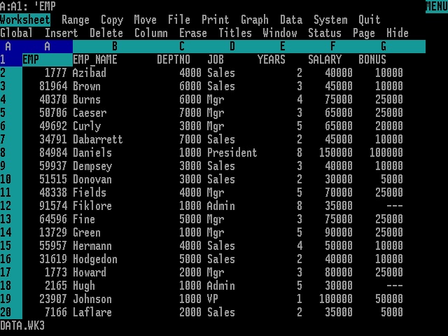
But spreadsheets were designed primarily as working tools rather than presentation tools. Their default appearance (gridlines everywhere, columns sized to fit content, minimal typographic distinction between headers and data) produced tables that were functional but rarely beautiful. While Excel and its competitors did include formatting capabilities, applying them consistently required manual effort, and the results often looked obviously “spreadsheet-generated” rather than professionally typeset. The gridline aesthetic became so associated with spreadsheet output that it acquired its own connotations: utilitarian, perhaps preliminary, not quite finished.
The web introduced yet another approach to tables. HTML included table elements from its earliest versions, recognizing that tabular data was fundamental to many kinds of web content. The <table>, <tr>, <td>, and <th> tags allowed developers to create tables directly in markup, and Cascading Style Sheets (CSS) provided control over appearance.
But HTML tables were notoriously difficult to style and even more difficult to make responsive. A table that looked acceptable on a desktop monitor might become unusable on a mobile phone. The rigid two-dimensional structure of tables conflicted with the fluid, reflowing layout that web design demanded. Web developers spent years wrestling with table formatting, and the challenges contributed to a backlash against tables that led some to avoid them entirely, even when tabular presentation would have been appropriate. For a period in the early 2000s, using tables for page layout was so discouraged that the stigma attached to all table usage, including legitimate tabular data.
1.7 Tables in statistical computing
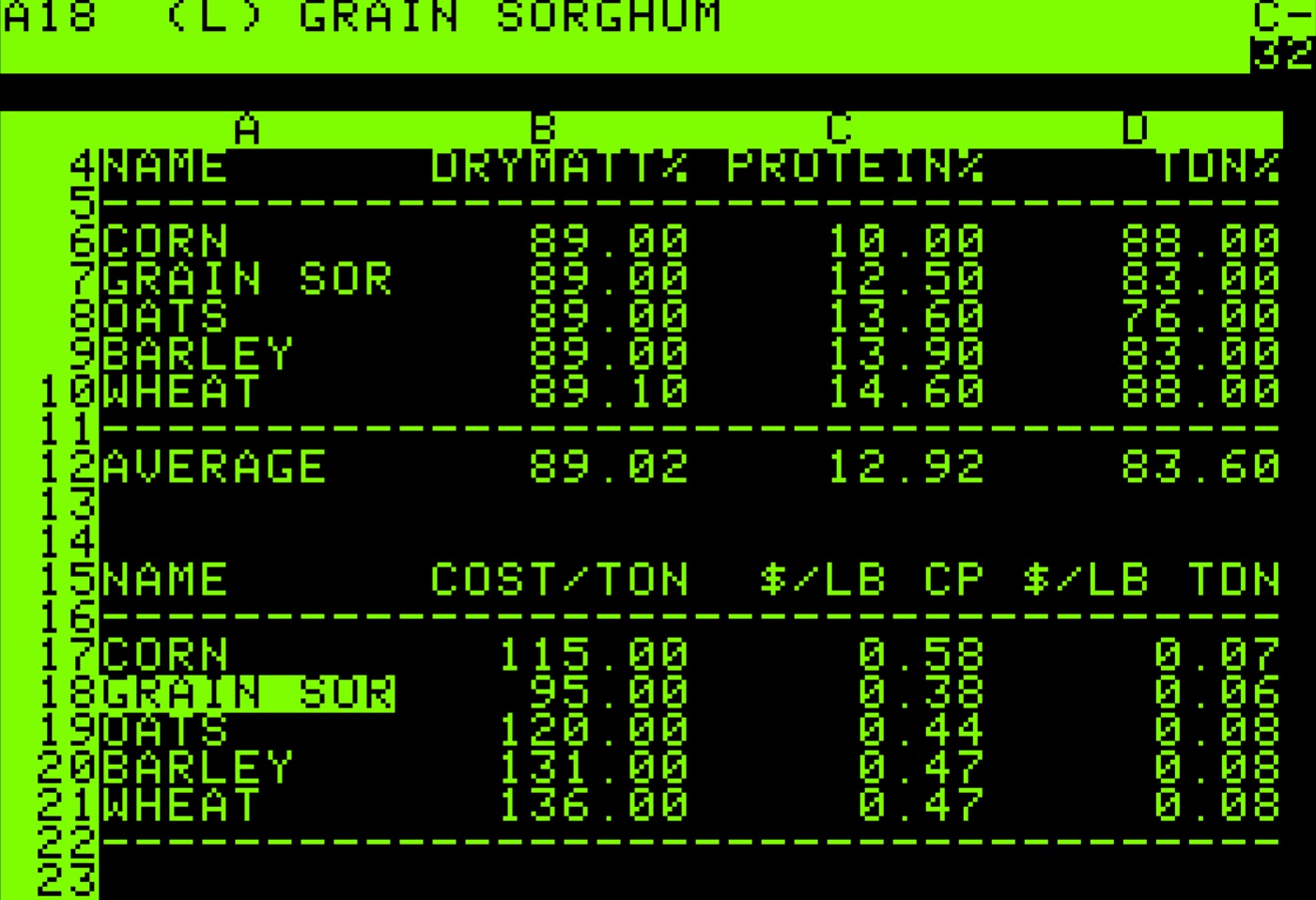
For statisticians and data analysts, the challenge of producing well-formatted tables has been particularly acute. Statistical software is typically better at computation (fitting models, testing hypotheses, summarizing distributions) but historically struggled at presentation. The outputs of statistical procedures were often functional but aesthetically impoverished: plain text, minimal formatting, no consideration of how the results would ultimately be communicated to readers.
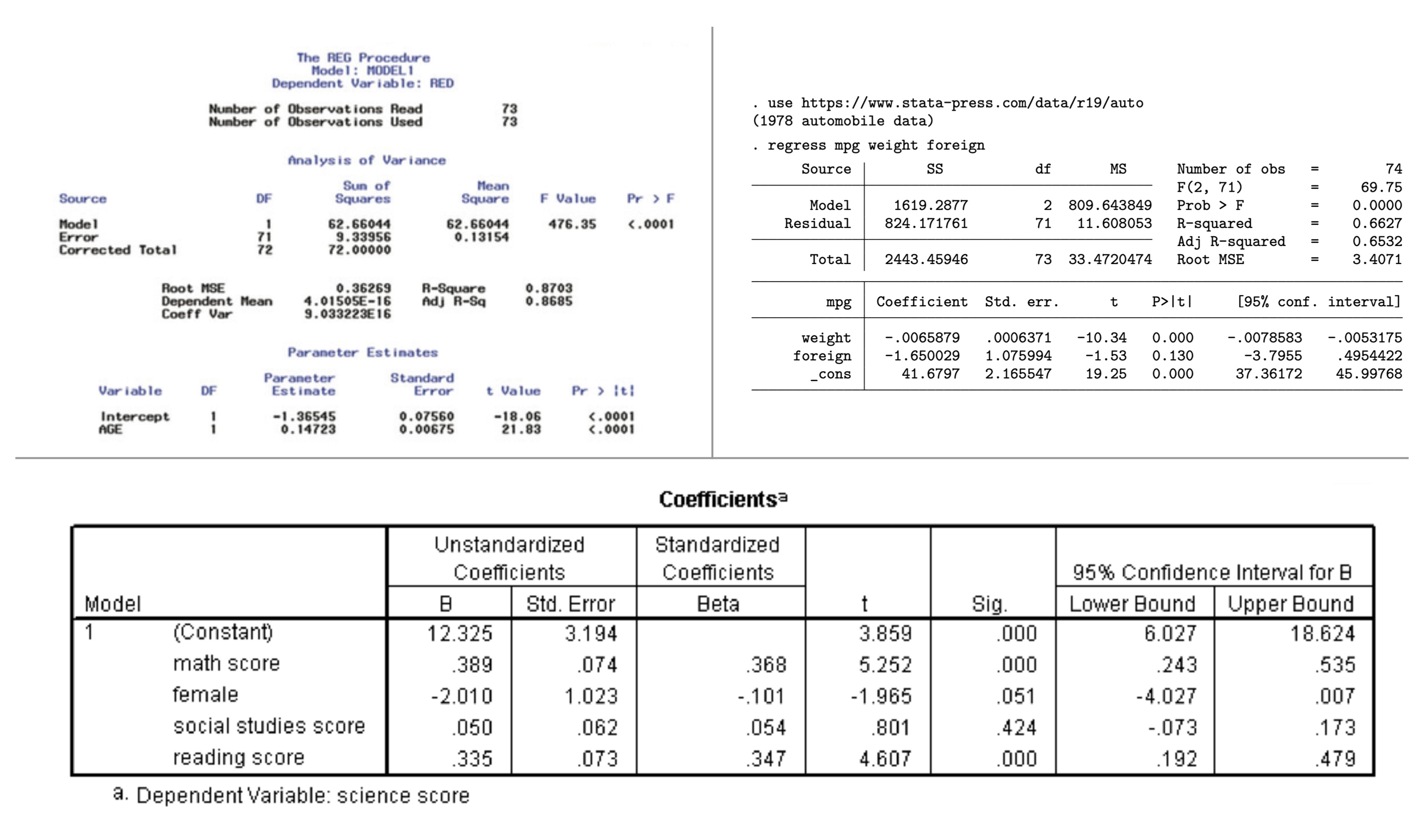
The oldest statistical software systems such as SAS, SPSS, and Stata developed their own conventions for tabular output that prioritized information density over visual appeal. A regression table from SAS might include every conceivable statistic, formatted to many decimal places, with labels abbreviated to fit narrow columns. These outputs were designed to be comprehensive rather than communicative; they assumed readers who would study the numbers carefully rather than scan them quickly.
This created a frustrating workflow. Analysts would perform their calculations in statistical software, then manually transfer the results into word processors or page layout applications for formatting. This transfer was error-prone and time-consuming, and it broke the connection between the analysis and its presentation. If the underlying data changed, the entire process had to be repeated. A single additional observation in the dataset might require re-running the analysis, re-transferring the numbers, and re-applying all the formatting.
The R programming language, which emerged in the 1990s as an open-source implementation of the S statistical language, inherited this limitation. R could produce statistical outputs of great sophistication, but getting those outputs into a professionally formatted table required either manual intervention or third-party tools with their own learning curves and limitations. The default R output was plain text, suitable for the console but not for publication.
Various R packages attempted to address this gap. Early solutions like xtable could convert R objects to LaTeX or HTML, but offered limited formatting control. The package produced serviceable output but required users to understand LaTeX table syntax for customization. Later packages like kable (part of the knitr ecosystem) provided simple table generation with reasonable defaults, making basic table creation straightforward but still limiting complex formatting. The formattable package introduced the idea of embedding visualizations within table cells (color scales, icons, and bar charts that augmented numerical values). DT brought interactive JavaScript datatables to R, enabling sorting, filtering, and pagination in web-based outputs. flextable offered a different approach with comprehensive support for Word and PowerPoint output. huxtable emphasized a tidy interface and conditional formatting. reactable provided another JavaScript-based solution with modern aesthetics.
Each package solved particular problems but none provided a comprehensive, unified approach to table creation. The landscape was fragmented. An analyst might use one package for simple tables, another for interactive tables, a third for tables with embedded graphics. The syntax and concepts differed across packages, and achieving consistent, high-quality formatting remained difficult. The tables produced by R (notwithstanding the sophistication of the underlying analyses) often fell short of the typographic standards that professional publishers had established over the preceding centuries.
The situation mirrored a broader challenge in data science: the gap between analysis and communication. Tools optimized for statistical computation did not prioritize presentation; tools designed for presentation did not connect easily to computational workflows. Bridging this gap required either extensive manual effort or compromises in quality.
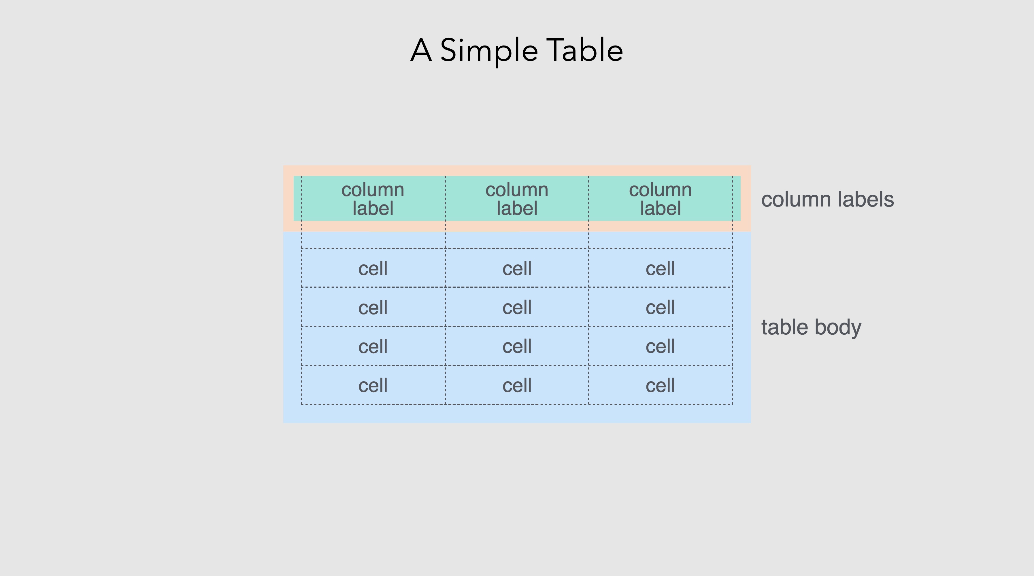
1.8 The structure of tables
Into this context came gt. The package drew significant inspiration from an unlikely source: a 266-page government manual published in 1949.
The Manual of Tabular Presentation, prepared by Bruce L. Jenkinson as Chief of the Statistical Reports Section at the U.S. Bureau of the Census, represents perhaps the most thorough treatment of table design ever produced (Jenkinson, 1949). The manual codified decades of accumulated wisdom from the Bureau’s experience preparing statistical publications, establishing terminology and principles that remain relevant today. It introduced precise vocabulary for table components: the stub (the leftmost column containing row labels), the boxhead (the structure of column headers), the field (the data cells themselves), spanners (headers that span multiple columns), and caption (the table’s title). It provided detailed guidance on everything from the placement of units to the alignment of figures to the handling of footnotes.
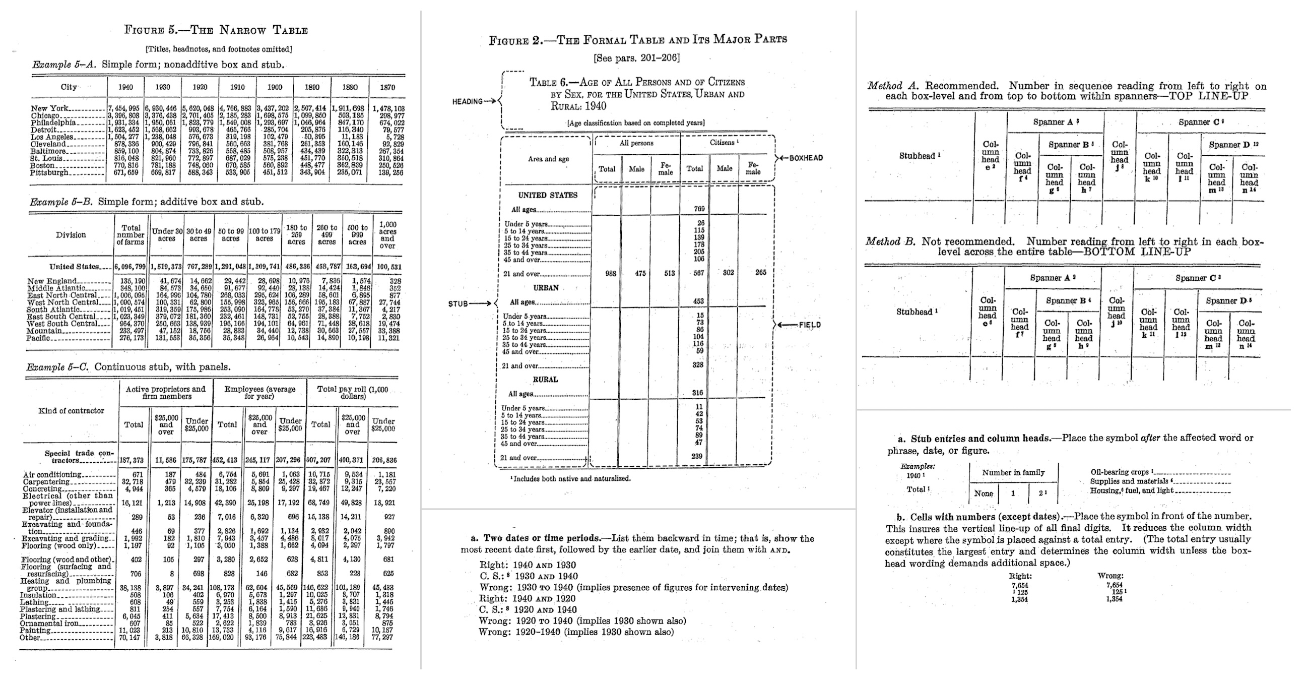
What made Jenkinson’s manual particularly valuable was its combination of practical specificity and principled reasoning. Rather than merely prescribing rules, it explained why certain conventions worked better than others. Why should numbers be right-aligned? Because this causes the decimal points to align, making comparison easier. Why should row labels be left-aligned? Because text is easier to read when it starts at a consistent position. Why should horizontal rules be used sparingly? Because excessive lines create visual clutter that impedes rather than aids comprehension.
Of course, not every recommendation from a 1949 manual translates directly to modern practice. The Census manual advocated for leaders (rows of dots or dashes connecting stub entries to their corresponding values across wide tables) a typographic convention that was common in mid-century printing but has largely fallen out of favor and proves difficult to implement in web-based rendering. The manual also endorsed more liberal use of vertical rules than contemporary taste typically permits; modern table design has trended toward minimalism, relying on white space and alignment rather than explicit lines to separate columns. Some conventions around capitalization, abbreviation, and the placement of units have similarly evolved. gt had to balance respect for the manual’s enduring insights with accommodation of changed expectations, taking what remained valuable while adapting to the aesthetic and technical context of tables rendered on screens rather than printed on paper.
More fundamentally, electronic tables deal with space differently than page-based tables. The printed page imposed hard constraints: a table had to fit within fixed margins, and if it didn’t, the designer had no choice but to abbreviate, reduce type size, or split the table across pages. Screen-based tables enjoy the affordance of scrolling. A table can extend beyond the visible viewport, and readers can navigate to see more. Yet this affordance brings its own challenges. On mobile devices, where screen real estate is precious, excessive scrolling becomes tiresome; a table that requires both horizontal and vertical scrolling to comprehend is a poor user experience. The old tricks of the trade (abbreviating column headers, attending to the balance and density of information, choosing what to include and what to omit) remain important, but the calculus has changed. A table destined for a printed report faces different constraints than one designed for a responsive web page that must render legibly on everything from a large desktop monitor to a narrow phone screen.
gt embodies many of the principles articulated in this foundational work, translated into the computational context of modern data analysis. The package recognizes that tables have a logical structure: components that exist independently of any particular visual rendering. A table has a body (the main grid of data cells), but it may also have a header (with title and subtitle), a footer (with footnotes and source notes), column labels, row labels, row groups, column spanners, and summary rows. Each of these components has its own properties (content, formatting, positioning) that can be specified independently.
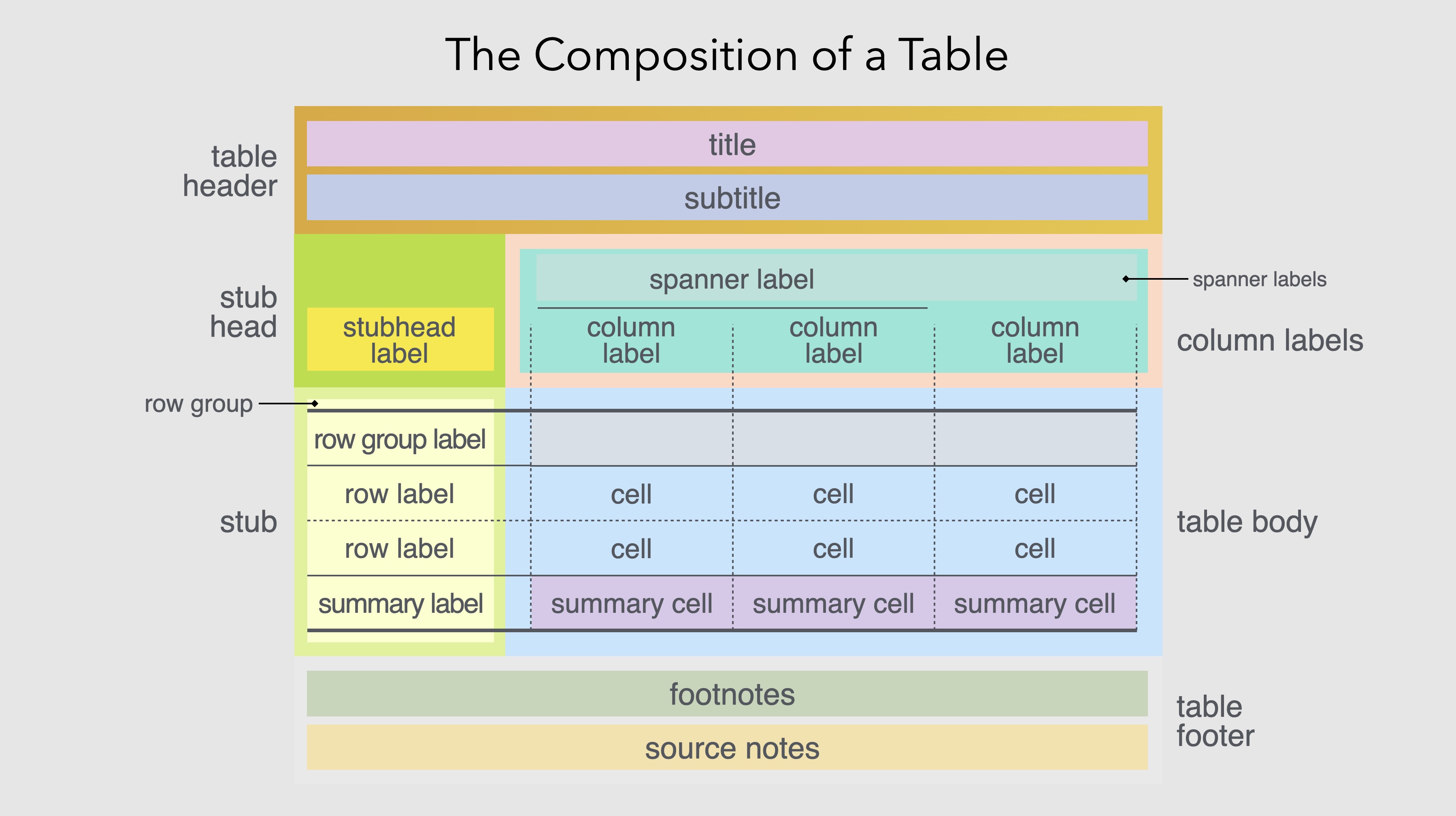
This structural decomposition reflects how people actually think about tables. When designing a table, we don’t think in terms of individual cell properties but, instead, we think in terms of structural elements (“this table needs a title”, “these columns should be grouped under a common header”, “the last row should show totals”). Each of these statements identifies a table component and an operation to perform on it. gt provides functions that correspond directly to these natural expressions of intent.
By providing distinct functions for each component and each type of operation, gt allows table construction to be expressed as a pipeline of transformations. One begins with data, passes it to gt() to create a table object, then pipes that object through functions that add headers, format values, apply styles, insert footnotes, and so on. Each step is self-contained and understandable as the overall table emerges from the cumulative effect of the pipeline.
This compositional approach brings several benefits. It makes table construction more systematic. Instead of clicking through menus or setting dozens of parameters in a single function call, users express their intentions through a sequence of discrete, meaningful operations. It makes tables more reproducible as the same code will produce the same table every time, with no manual steps that might introduce variation. And it makes tables more maintainable. If the underlying data changes, the table can be regenerated automatically. If the formatting needs adjustment, specific functions can be modified without disturbing the rest of the pipeline.
The pipeline approach also facilitates iterative refinement. A table can be built incrementally, with each step producing a visible result that can be evaluated before proceeding. This matches how designers actually work: they start with a rough version, assess it, make adjustments, and gradually converge on a finished product. The code-based workflow makes this iteration explicit and reversible. Any change can be undone simply by removing or modifying the corresponding line of code.
1.9 What gt does
At its core, gt transforms data into formatted display tables suitable for publication, reporting, or presentation. The package handles the entire workflow: accepting data from R (typically as data frames or tibbles), organizing that data into the structural components of a table, applying formatting and styling, and rendering the result in various output formats including HTML, LaTeX, RTF, and Word.
The starting point is always data. gt accepts data frames and tibbles (the standard tabular data structures in R) and treats them as the raw material from which tables are constructed. This connection to R’s data ecosystem means that the full power of R’s data manipulation capabilities is available upstream of table creation. Users can filter, transform, aggregate, and reshape their data using familiar tools like dplyr and tidyr, then pass the result directly to gt.
The table body, the main grid of data, is where gt begins its work. The fmt_*() family of functions formats cell values according to their type: numbers with specified decimal places and digit separators, currencies with appropriate symbols and conventions, dates and times in chosen styles, percentages, scientific notation, and more. These formatting functions operate on columns and can be applied conditionally to specific rows. The separation of data from formatting is crucial: the underlying values remain available for computation even as their display is customized for human readers.
exibble |>
  dplyr::select(num, currency, date) |>
  dplyr::slice_head(n = 5) |>
  gt() |>
  fmt_number(columns = num, decimals = 1) |>
  fmt_currency(columns = currency, currency = "EUR") |>
fmt_date(columns = date, date_style = "yMMMd")| num | currency | date |
|---|---|---|
| 0.1 | €49.95 | Jan 15, 2015 |
| 2.2 | €17.95 | Feb 15, 2015 |
| 33.3 | €1.39 | Mar 15, 2015 |
| 444.4 | €65,100.00 | Apr 15, 2015 |
| 5,550.0 | €1,325.81 | May 15, 2015 |
Column labels can be set, renamed, or generated programmatically. The original column names from the data frame are retained internally (for reference in code) while display labels can be freely customized. Columns can be grouped under spanning headers that convey hierarchical relationships, which is a common requirement when presenting data with natural groupings (such as multiple years within categories or different measurements of the same variable). Rows can be organized into groups with their own labels, and summary rows can present aggregations like totals or averages at the group or table level.
The package provides extensive control over visual styling. Colors, fonts, borders, padding, and alignment can be applied globally through table options or selectively through styling functions that target specific cells, columns, rows, or regions. The targeting system is precise: you can style the third row of a specific column, all cells exceeding a threshold, or the header of a particular row group. Conditional formatting allows styles to respond to data values, highlighting cells that exceed thresholds, coloring values along a gradient, marking missing data with distinctive treatment.
towny |>
  dplyr::select(name, population_2021, density_2021) |>
  dplyr::slice_max(population_2021, n = 8) |>
  gt() |>
  tab_header(
    title = "Ontario's Largest Municipalities",
    subtitle = "Population and density from the 2021 census"
  ) |>
  fmt_integer(columns = c(population_2021, density_2021)) |>
  cols_label(
    name = "Municipality",
    population_2021 = "Population",
    density_2021 = "Density (per km²)"
  ) |>
  tab_source_note(source_note = "Source: Statistics Canada") |>
  data_color(
    columns = density_2021,
    palette = c("white", "steelblue")
)| Ontario's Largest Municipalities | ||
| Population and density from the 2021 census | ||
| Municipality | Population | Density (per km²) |
|---|---|---|
| Toronto | 2,794,356 | 4,428 |
| Ottawa | 1,017,449 | 365 |
| Mississauga | 717,961 | 2,453 |
| Brampton | 656,480 | 2,469 |
| Hamilton | 569,353 | 509 |
| London | 422,324 | 1,004 |
| Markham | 338,503 | 1,605 |
| Vaughan | 323,103 | 1,186 |
| Source: Statistics Canada | ||
Beyond basic formatting, gt supports several features that extend the communicative power of tables. Footnotes can be attached to specific cells, columns, or other table elements, with automatic mark generation and placement. The package handles the bookkeeping of which footnote mark corresponds to which note. Images and plots can be embedded in cells, enabling small multiples or sparkline-style visualizations within the table structure. Nanoplots, tiny inline charts, can be generated directly from row data, adding a visual dimension to otherwise numerical displays. These features blur the line between traditional tables and data visualization, creating hybrid displays that combine the precision of tabular data with the pattern-revealing power of graphics.
The package also addresses the practical realities of professional table production. Locale settings control language and formatting conventions automatically. Decimal separators, date formats, currency symbols all adjust appropriately. A table formatted for American readers uses periods as decimal separators and formats dates as month/day/year. The same table formatted for German readers uses commas as decimal separators and formats dates as day.month.year. This internationalization support is essential for producing tables that will be read across linguistic and cultural boundaries.
Output can be generated in multiple formats from the same code, ensuring consistency across HTML reports, PDF documents, and Word files. This multi-format capability addresses a persistent challenge in document production: the need to produce essentially the same table for different output contexts. Integration with Quarto allows tables to be embedded in reproducible documents that combine prose, code, and output.
1.10 Principles of effective table design
gt is a tool, and like any tool, its effectiveness depends on how it is used. The package provides capabilities but does not enforce particular design choices. That responsibility falls to the table maker, who must consider both the nature of the data and the needs of the audience.
Certain principles have emerged from the long history of table design, and gt is built to support them. The statistician Andrew Ehrenberg, who studied table design systematically, articulated several principles that remain influential (Ehrenberg, 1977). Round numbers to two significant digits unless more precision is genuinely needed as excessive decimal places create clutter without adding information. Order rows and columns meaningfully rather than arbitrarily. Either by size, chronology, or some other logic that aids comprehension. Use row and column totals to provide context and enable checking. Put figures to be compared in columns rather than rows, since vertical comparison is easier than horizontal (Wainer, 1984).
Simplicity generally serves comprehension as tables should contain only the information necessary for the reader’s purpose (with minimal visual clutter). Every line, border, and typographic effect should justify its presence. This doesn’t mean tables should be stark or austere. Appropriate styling can guide attention and improve readability. But decoration for its own sake distracts from the data.
Alignment matters: numbers should typically be right-aligned so decimal places line up for easy comparison. Text should generally be left-aligned for readability. Mixed alignment within a column (some values right-aligned, others left-aligned) creates visual chaos. Column widths should be proportional to content as overly wide columns waste space while overly narrow columns truncate or wrap awkwardly.
Rules should be used purposefully to separate logical sections, not applied uniformly to every row and column. The heavy gridlines that spreadsheets produce by default are almost never the best choice for a presentation table. Horizontal rules effectively separate headers from body and body from footer. Vertical rules on the other hand are rarely necessary and are often harmful. The white space between columns, combined with alignment, usually provides sufficient separation.
Headers should be distinct but not overwhelming. They exist to orient the reader, not to compete with the data for attention. A common mistake is making headers so prominent (large, bold, perhaps colored) that they dominate the table visually. The data should be the star while headers are the supporting players.
Context matters enormously. A table for scientific publication may need to meet specific journal requirements: particular fonts, prescribed numbers of decimal places, required statistical information. A table for a business dashboard may need to update dynamically as data changes. A table in a slide presentation must be readable from across a room, which typically means fewer rows, larger text, and higher contrast than a table intended for close reading. gt provides the flexibility to address these varying needs, but the table maker must understand what the situation requires.
Perhaps most importantly, effective tables are those that respect the reader’s time and cognitive resources. Every element should serve a purpose. If a column doesn’t contribute to the reader’s understanding, omit it. If a value doesn’t need five decimal places, round it. If the table is too large to digest at a glance, consider whether it should be broken into multiple smaller tables, or whether a visualization might better reveal the patterns in the data.
1.11 Tables across languages and cultures
Tables, unlike prose, might seem culturally neutral. Numbers are numbers, after all. But the presentation of tabular information is more culturally embedded than it first appears. Different languages have different conventions for number formatting, date representation, and text direction, and these conventions affect how tables should be designed for different audiences.
The decimal separator is perhaps the most obvious example. In the United States, the United Kingdom, and many other countries, the period separates the integer and fractional parts of a number: 3.14159. In much of continental Europe, Latin America, and elsewhere, the comma serves this function: 3,14159. The digit grouping separator (used to break up large numbers for readability) similarly varies: where Americans write 1,000,000, Germans write 1.000.000 and the French write 1 000 000 (using thin spaces).
| Number Formatting Across Locales | ||
| The same population figures formatted according to each country's locale conventions, showing variation in digit grouping separators. Locale codes combine a language (e.g., 'de' for German) with a region (e.g., 'CH' for Switzerland). | ||
| Country | Locale | Population (2024) |
|---|---|---|
| United States | en | 340,110,988 |
| Germany | de | 83.510.950 |
| France | fr | 68 516 699 |
| Brazil | pt-BR | 211.998.573 |
| India | hi-IN | 1,450,935,791 |
| Japan | ja | 123,975,371 |
| Italy | it | 58.986.023 |
| Switzerland | de-CH | 9’034’102 |
Currency formatting varies even more widely. The currency symbol may precede or follow the amount. Negative amounts may be indicated with a minus sign, parentheses, or red coloring. The number of decimal places expected varies by currency. A table of financial data formatted for one country may be confusing or even misleading when viewed in another.
| Currency Formatting Across Locales | ||
| The same base value formatted with each country's currency and locale conventions. Note the variation in symbol placement, decimal separators, and digit grouping. | ||
| Country | Locale and Currency |
Value |
|---|---|---|
| United States | en/USD | $1,234.56 |
| Germany | de/EUR | €1.234,56 |
| France | fr/EUR | €1 234,56 |
| Japan | ja/JPY | ¥1,235 |
| Switzerland | de-CH/CHF | SFr.1’234.56 |
| Denmark | da/DKK | kr.1.234,56 |
Date formatting is notoriously variable. Americans typically write month/day/year while much of the rest of the world uses day/month/year. East Asian countries often use year/month/day. A date written as “03/04/2024” is ambiguous without knowing the intended convention. It could be March 4, April 3, or (in some East Asian formats) part of 2024 depending on context.
| Date Formatting Across Locales | ||
| The same date (March 4, 2024) formatted using the flexible 'yMd' style, which adapts to each locale's conventions. Note how the order of month and day varies, making '03/04/2024' ambiguous without context. | ||
| Country | Locale | March 4, 2024 |
|---|---|---|
| United States | en-US | 3/4/2024 |
| United Kingdom | en-GB | 04/03/2024 |
| Germany | de-DE | 4.3.2024 |
| France | fr-FR | 04/03/2024 |
| Japan | ja | 2024/3/4 |
| China | zh | 2024/3/4 |
Even the direction of reading affects table design. In languages that read right-to-left, such as Arabic and Hebrew, tables may need to be mirrored so that the visual flow matches reading expectations. While the underlying data remains the same, the presentation must adapt to the audience.
| Text Direction in Different Scripts | |||
| Languages with right-to-left scripts present unique challenges for table design. Note that Arabic and Persian use their own numerals, while Hebrew typically uses Western numerals. | |||
| Language | Reading Direction | Greeting | Numerals |
|---|---|---|---|
| English | Left-to-Right | Hello | 1, 2, 3 |
| Arabic | Right-to-Left | مرحبا |
١، ٢، ٣ |
| Hebrew | Right-to-Left | שלום |
1, 2, 3 |
| Persian | Right-to-Left | سلام |
۱، ۲، ۳ |
gt addresses these challenges through its locale system. By specifying a locale, table makers can automatically apply the appropriate formatting conventions for their intended audience. Numbers format with the correct separators, dates display in the expected order, and currencies appear with appropriate symbols and positioning. This internationalization support is not merely cosmetic. It’s essential for producing tables that communicate clearly across linguistic and cultural boundaries.
The localization challenge extends beyond mere formatting to considerations of what information to include and how to organize it. A table designed for expert readers might use technical abbreviations and assume background knowledge. The same information presented to a general audience might require fuller explanations and more careful labeling. While gt cannot make these editorial decisions for you, it provides the flexibility to implement whatever choices you make.
1.12 Tables in the modern data ecosystem
Tables occupy a distinctive position in contemporary data communication. They sit between raw data and visualized insights: more structured than the former, more precise than the latter. In a world where dashboards, infographics, and interactive visualizations attract much attention, tables might seem old-fashioned. But their utility endures precisely because they serve needs that other formats cannot.
When a researcher needs to report exact statistical results, tables are the standard. A coefficient estimate of 0.237 with a standard error of 0.042 cannot be adequately conveyed by a bar chart. The precision matters, and only a table preserves it. When an analyst needs to verify that calculated values match source data, tables provide the transparency that charts cannot. A bar plot shows proportions while a table shows exactly how many observations fall into each category. When a regulatory filing requires specific numbers in specific formats, tables meet the requirement. The austere precision of a well-constructed table has a credibility that no visualization can match.
Tables also serve as a bridge between computational and documentary workflows. Data flows from databases and APIs into analytical environments. Tables allow that data to flow out into reports, presentations, and publications. A table is a snapshot of data at a moment in time, formatted for human comprehension. This is a translation from the machine-readable to the human-readable.
At the same time, the line between tables and visualizations has begun to blur. Modern tables can incorporate color, icons, and embedded charts that add visual dimensions without sacrificing tabular structure. gt’s support for nanoplots and inline visualizations reflects this evolution. A column of numbers might be accompanied by a column of sparklines showing trends (a percentage might be visualized as a progress bar within its cell). The table is no longer purely textual as it can combine the precision of numbers with the pattern-revealing power of graphics.
This hybrid approach, tables enhanced with visual elements, represents a synthesis of previously separate traditions. The tabular presentation provides structure, precision, and lookup capability. The visual elements provide pattern recognition and at-a-glance comprehension. Well-designed hybrid tables give readers multiple entry points: they can scan the visual elements to identify interesting patterns, then consult the numbers for precision.
The tools for creating tables have also matured. What once required manual typesetting or laborious formatting can now be accomplished programmatically, with full reproducibility and version control. A table created with gt is a piece of code as it can be reviewed, tested, modified, and shared like any other code artifact. This represents a significant advance over the point-and-click table creation that remains common in many workflows. When the data changes, the table regenerates automatically. When a colleague suggests modifications, you can see exactly what changed in version control. When you need to create similar tables for different datasets, you can reuse and adapt the code.
The programmatic approach also enables automation at scale. A single template can generate hundreds of tables for different subsets of data or different reporting periods. Reports that once required days of manual formatting can be produced in minutes. This scalability transforms what tables can accomplish in organizational contexts as they become not just presentation artifacts but components of automated data pipelines.
1.13 Looking ahead
This book is about making effective display tables with gt. The chapters that follow will explore the package’s capabilities systematically, from basic table construction through advanced formatting, styling, and integration techniques. Along the way, we’ll encounter both technical details and design considerations, because effective tables require both.
We’ll begin with the fundamental structure of gt tables. How to create them from data, how to organize rows and columns, how to add headers and footers. We’ll then explore the extensive formatting capabilities that transform raw values into polished presentations: number formatting, date handling, currency display, and more. From there, we’ll move to styling which involves colors, fonts, borders, and the visual elements that give tables their distinctive appearance. We’ll examine advanced features like embedded visualizations, interactive outputs, and multi-format export. Throughout, we’ll consider not just how to use these features but when to use them. Such design principles can distinguish effective tables from mere data dumps.
But before diving into those specifics, it’s worth pausing to appreciate what tables represent. They are among humanity’s oldest information technologies. Older than writing, older than mathematics as a formal discipline, older than most of the institutions we take for granted. The Babylonian scribes who created multiplication tables four thousand years ago would recognize, in principle, the tables we create today. The rows and columns, the headers and footers, the careful alignment of values: these elements have persisted across millennia because they work. They match how human minds process structured information.
The fact that we’re still making tables today, using tools that would be recognizable in principle to a Babylonian scribe, speaks to the enduring power of the basic concept. Technology has changed the production process dramatically but the fundamental format remains. This persistence through technological revolutions suggests that tables tap into something deep about human cognition, something that won’t be superseded by the next technological development.
gt is the latest contribution to this long tradition. It won’t be the last. But it represents a well thought-out synthesis of what has been learned about table design over centuries, combined with the capabilities that modern computing makes possible. The package embodies certain convictions: that tables should be reproducible, that they should be beautiful as well as functional, that their construction should be systematic rather than ad hoc, and that the tools for making them should respect the intelligence of both creators and readers.
The goal of this book is to help you use gt effectively for creating tables that inform, clarify, and communicate with the precision and elegance that the format has always promised. Whether you’re preparing tables for scientific publication, business reporting, government documentation, or personal projects, the principles are the same: understand your data, respect your audience, and craft your presentation with care. The tools have never been better and the opportunity to create excellent tables has never been more accessible.
Let us begin.
1.14 References
The historical material in this chapter draws on numerous sources. For readers interested in exploring further, the following works provide authoritative treatments of the topics discussed.
1.14.1 On early mathematical notation and the Ishango bone
- de Heinzelin, Jean. “Ishango”. Scientific American 206, no. 6 (June 1962): 105–116. The original scholarly publication describing the discovery and interpretation of the Ishango bone.
- Huylebrouck, Dirk. Africa and Mathematics. Mathematics, Culture, and the Arts. Cham: Springer International Publishing, 2019. Chapter 9, “Missing Link”, provides a comprehensive review of research on the Ishango bone.
- Joseph, George Gheverghese. The Crest of the Peacock: Non-European Roots of Mathematics. 3rd ed. Princeton: Princeton University Press, 2011. An essential work on mathematical development across cultures.
1.14.2 On Babylonian mathematics and astronomical tables
- Neugebauer, Otto. The Exact Sciences in Antiquity. 2nd ed. Providence: Brown University Press, 1957. The foundational scholarly work on Babylonian mathematical astronomy.
- Robson, Eleanor. Mathematics in Ancient Iraq: A Social History. Princeton: Princeton University Press, 2008. A comprehensive modern treatment of Mesopotamian mathematics.
- Robson, Eleanor. “Tables and Tabular Formatting in Sumer, Babylonia, and Assyria, 2500–50 BCE”. In The History of Mathematical Tables from Sumer to Spreadsheets, edited by Martin Campbell-Kelly, Mary Croarken, Raymond G. Flood, and Eleanor Robson, 18–47. Oxford: Oxford University Press, 2003. A detailed examination of ancient Mesopotamian tables and their conventions.
- Hunger, Hermann, and David Pingree. Astral Sciences in Mesopotamia. Leiden: Brill, 1999. Detailed coverage of MUL.APIN and other astronomical compendia.
1.14.3 On Egyptian mathematics
- Imhausen, Annette. Mathematics in Ancient Egypt: A Contextual History. Princeton: Princeton University Press, 2016.
- Clagett, Marshall. Ancient Egyptian Science: A Source Book. Vol. 3, Ancient Egyptian Mathematics. Philadelphia: American Philosophical Society, 1999.
1.14.4 On Greek astronomy and Ptolemy
- Toomer, G. J., trans. Ptolemy’s Almagest. London: Duckworth, 1984. The standard English translation.
- Jones, Alexander. “The Adaptation of Babylonian Methods in Greek Numerical Astronomy”. Isis 82, no. 3 (1991): 441–453.
1.14.5 On Islamic astronomical tables
- Kennedy, E. S. “A Survey of Islamic Astronomical Tables.” Transactions of the American Philosophical Society 46, no. 2 (1956): 123–177. The classic survey of Zij literature.
- Saliba, George. Islamic Science and the Making of the European Renaissance. Cambridge, MA: MIT Press, 2007.
1.14.6 On the history of accounting and double-entry bookkeeping
- Pacioli, Luca. Summa de Arithmetica, Geometria, Proportioni et Proportionalita. Venice, 1494. The work that systematized double-entry bookkeeping.
- Sangster, Alan, Greg N. Stoner, and Patricia McCarthy. “The Market for Luca Pacioli’s Summa Arithmetica.” Accounting Historians Journal 35, no. 1 (2008): 111–134.
1.14.7 On logarithms and mathematical tables
- Napier, John. Mirifici Logarithmorum Canonis Descriptio. Edinburgh, 1614.
- Roegel, Denis. “Napier’s Ideal Construction of the Logarithms.” LOCOMAT project, 2012. Available at: https://locomat.loria.fr.
- Campbell-Kelly, Martin, et al., eds. The History of Mathematical Tables: From Sumer to Spreadsheets. Oxford: Oxford University Press, 2003. An excellent collection covering tables from antiquity through the computer age.
1.14.9 On railway timetables
- Bradshaw, George. Bradshaw’s Railway Time Tables and Assistant to Railway Travelling. Manchester, 1839. The first edition of the famous guide.
- Simmons, Jack. The Victorian Railway. London: Thames and Hudson, 1991.
1.14.10 On cognitive science and information processing
- Miller, George A. “The Magical Number Seven, Plus or Minus Two: Some Limits on Our Capacity for Processing Information”. Psychological Review 63, no. 2 (1956): 81–97. The classic paper on working memory capacity.
- Tufte, Edward R. The Visual Display of Quantitative Information. 2nd ed. Cheshire, CT: Graphics Press, 2001.
1.14.11 On table design principles
- Ehrenberg, A. S. C. “Rudiments of Numeracy”. Journal of the Royal Statistical Society, Series A 140, no. 3 (1977): 277–297.
- Ehrenberg, A. S. C. “The Problem of Numeracy”. The American Statistician 35, no. 2 (1981): 67–71.
- Wainer, Howard. “How to Display Data Badly”. The American Statistician 38, no. 2 (1984): 137–147.
1.14.12 On the history of statistics and quantification
- Best, Joel. Damned Lies and Statistics: Untangling Numbers from the Media, Politicians, and Activists. Berkeley: University of California Press, 2001. An accessible examination of how statistics can mislead, with particular attention to how tabular presentation creates an illusion of precision.
- Porter, Theodore M. Trust in Numbers: The Pursuit of Objectivity in Science and Public Life. Princeton: Princeton University Press, 1995.
- Desrosières, Alain. The Politics of Large Numbers: A History of Statistical Reasoning. Translated by Camille Naish. Cambridge, MA: Harvard University Press, 1998.
1.14.13 On early computing and table generation
- Goldstine, Herman H. The Computer from Pascal to von Neumann. Princeton: Princeton University Press, 1972.
- Ceruzzi, Paul E. A History of Modern Computing. 2nd ed. Cambridge, MA: MIT Press, 2003.
1.14.14 On the foundational work for gt
- Jenkinson, Bruce L. Manual of Tabular Presentation: An Outline of Theory and Practice in the Presentation of Statistical Data in Tables for Publication. Washington, DC: U.S. Bureau of the Census, 1949. The 266-page government manual that established terminology and principles for table design that remain influential today.